

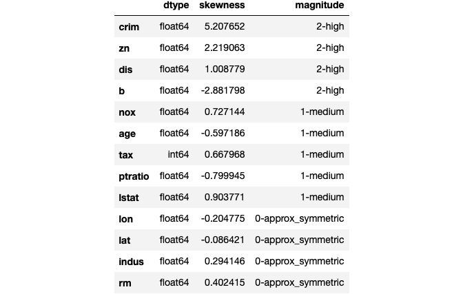
Statistics is a building block of data science

Data science is an interdisciplinary field. One of the building blocks of data science is statistics. Without a decent level of statistics knowledge, it would be highly difficult to understand or interpret the data.
Statistics helps us explain the data. We use statistics to infer results about a population based on a sample drawn from that population. Furthermore, machine learning and statistics have plenty of overlaps.
Long story short, one needs to study and learn statistics and its concepts to become a data scientist. In this article, I will try to explain 10 fundamental statistical concepts.
1. Population and sample
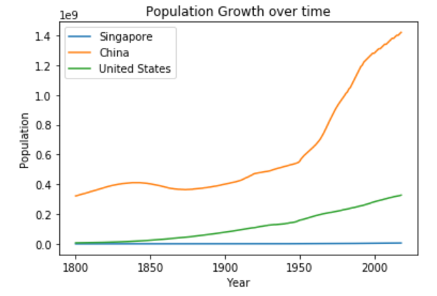
Populationis all elements in a group. For example, college students in US is a population that includes all of the college students in US. 25-year-old people in Europe is a population that includes all of the people that fits the description.
It is not always feasible or possible to do analysis on population because we cannot collect all the data of a population. Therefore, we use samples.
Sampleis a subset of a population. For example, 1000 college students in US is a subset of “college students in US” population.
2. Normal distribution
Probability distribution is a function that shows the probabilities of the outcomes of an event or experiment. Consider a feature (i.e. column) in a dataframe. This feature is a variable and its probability distribution function shows the likelihood of the values it can take.
Probability distribution functions are quite useful in predictive analytics or machine learning. We can make predictions about a population based on the probability distribution function of a sample from that population.
Normal (Gaussian) distribution is a probability distribution function that looks like a bell.
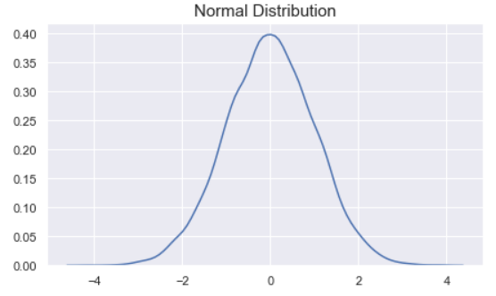
The peak of the curve indicates the most likely value the variable can take. As we move away from the peak the probability of the values decrease.
3. Measures of central tendency
Central tendency is the central (or typical) value of a probability distribution. The most common measures of central tendency are mean, median, and mode.
- Mean is the average of the values in series.
- Median is the value in the middle when values are sorted in ascending or descending order.
- Mode is the value that appears most often.
4. Variance and standard deviation
Variance is a measure of the variation among values. It is calculated by adding up squared differences of each value and the mean and then dividing the sum by the number of samples.

Standard deviation is a measure of how spread out the values are. To be more specific, it is the square root of variance.
Note: Mean, median, mode, variance, and standard deviation are basic descriptive statistics that help to explain a variable.
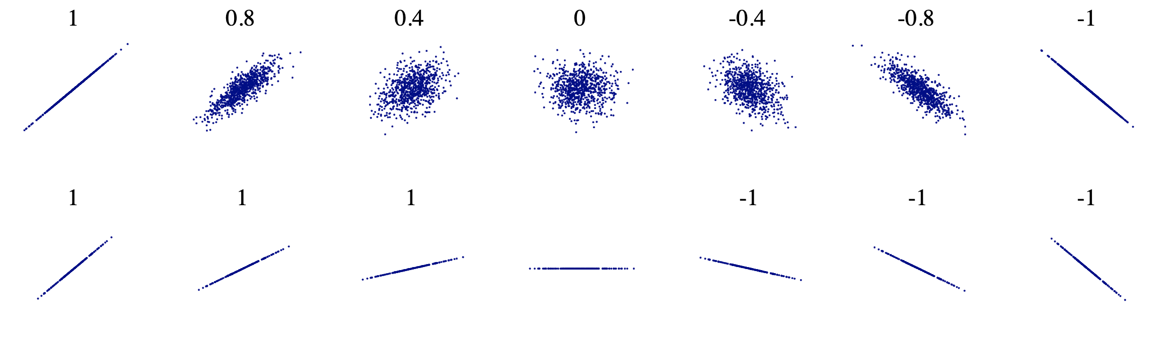
5. Covariance and correlation
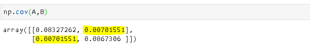
Covariance is a quantitative measure that represents how much the variations of two variables match each other. To be more specific, covariance compares two variables in terms of the deviations from their mean (or expected) value.
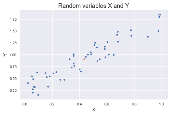
The figure below shows some values of the random variables X and Y. The orange dot represents the mean of these variables. The values change similarly with respect to the mean value of the variables. Thus, there is positive covariance between X and Y.

The formula for covariance of two random variables:

where E is the expected value and µ is the mean.
Note: The covariance of a variable with itself is the variance of that variable.
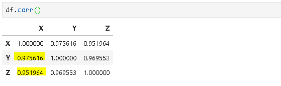
Correlation is a normalization of covariance by the standard deviation of each variable.

where σ is the standard deviation.
This normalization cancels out the units and the correlation value is always between 0 and 1. Please note that this is the absolute value. In case of a negative correlation between two variables, the correlation is between 0 and -1. If we are comparing the relationship among three or more variables, it is better to use correlation because the value ranges or unit may cause false assumptions.
6. Central limit theorem
In many fields including natural and social sciences, when the distribution of a random variable is unknown, normal distribution is used.
Central limit theorem (CLT) justifies why normal distribution can be used in such cases. According to the CLT, as we take more samples from a distribution, the sample averages will tend towards a normal distribution regardless of the population distribution.
Consider a case that we need to learn the distribution of the heights of all 20-year-old people in a country. It is almost impossible and, of course not practical, to collect this data. So, we take samples of 20-year-old people across the country and calculate the average height of the people in samples. CLT states that as we take more samples from the population, sampling distribution will get close to a normal distribution.
Why is it so important to have a normal distribution? Normal distribution is described in terms of mean and standard deviation which can easily be calculated. And, if we know the mean and standard deviation of a normal distribution, we can compute pretty much everything about it.
7. P-value
P-value is a measure of the likelihood of a value that a random variable takes. Consider we have a random variable A and the value x. The p-value of x is the probability that A takes the value x or any value that has the same or less chance to be observed. The figure below shows the probability distribution of A. It is highly likely to observe a value around 10. As the values get higher or lower, the probabilities decrease.
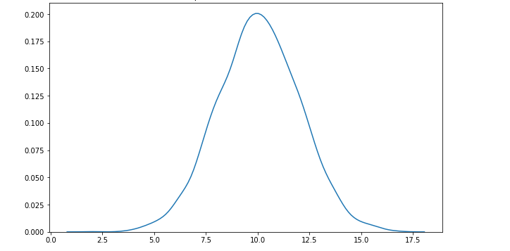
We have another random variable B and want to see if B is greater than A. The average sample means obtained from B is 12.5 . The p value for 12.5 is the green area in the graph below. The green area indicates the probability of getting 12.5 or a more extreme value (higher than 12.5 in our case).

Let’s say the p value is 0.11 but how do we interpret it? A p value of 0.11 means that we are 89% sure of the results. In other words, there is 11% chance that the results are due to random chance. Similarly, a p value of 0.05 means that there is 5% chance that the results are due to random chance.
Note: Lower p values show more certainty in the result.
If the average of sample means from the random variable B turns out to be 15 which is a more extreme value, the p value will be lower than 0.11.

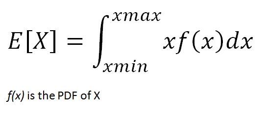
8. Expected value of random variables
The expected value of a random variable is the weighted average of all possible values of the variable. The weight here means the probability of the random variable taking a specific value.
The expected value is calculated differently for discrete and continuous random variables.
- Discrete random variables take finitely many or countably infinitely many values. The number of rainy days in a year is a discrete random variable.
- Continuous random variables take uncountably infinitely many values. For instance, the time it takes from your home to the office is a continuous random variable. Depending on how you measure it (minutes, seconds, nanoseconds, and so on), it takes uncountably infinitely many values.
The formula for the expected value of a discrete random variable is:

The expected value of a continuous random variable is calculated with the same logic but using different methods. Since continuous random variables can take uncountably infinitely many values, we cannot talk about a variable taking a specific value. We rather focus on value ranges.
In order to calculate the probability of value ranges, probability density functions (PDF) are used. PDF is a function that specifies the probability of a random variable taking value within a particular range.
9. Conditional probability
Probability simply means the likelihood of an event to occur and always takes a value between 0 and 1 (0 and 1 inclusive). The probability of event A is denoted as p(A) and calculated as the number of the desired outcome divided by the number of all outcomes. For example, when you roll a die, the probability of getting a number less than three is 2 / 6. The number of desired outcomes is 2 (1 and 2); the number of total outcomes is 6.
Conditional probability is the likelihood of an event A to occur given that another event that has a relation with event A has already occurred.
Suppose that we have 6 blue balls and 4 yellows placed in two boxes as seen below. I ask you to randomly pick a ball. The probability of getting a blue ball is 6 / 10 = 0,6. What if I ask you to pick a ball from box A? The probability of picking a blue ball clearly decreases. The condition here is to pick from box A which clearly changes the probability of the event (picking a blue ball). The probability of event A given that event B has occurred is denoted as p(A|B).

10. Bayes’ theorem
According to Bayes’ theorem, probability of event A given that event B has already occurred can be calculated using the probabilities of event A and event B and probability of event B given that A has already occurred.

Bayes’ theorem is so fundamental and ubiquitous that a field called “bayesian statistics” exists. In bayesian statistics, the probability of an event or hypothesis as evidence comes into play. Therefore, prior probabilities and posterior probabilities differ depending on the evidence.
Naive bayes algorithm is structured by combining bayes’ theorem and some naive assumptions. Naive bayes algorithm assumes that features are independent of each other and there is no correlation between features.
Conclusion
We have covered some basic yet fundamental statistical concepts. If you are working or plan to work in the field of data science, you are likely to encounter these concepts.
There is, of course, much more to learn about statistics. Once you understand the basics, you can steadily build your way up to advanced topics.


