Must-Know Machine Learning Algorithms for Data Scientists

Machine learning is the science of getting computers to act without being explicitly programmed.” — Andrew Ng

Machine learning algorithms are a crucial part of data science, allowing us to make predictions and understand complex data sets. In this guide, we will cover the top 10 machine learning algorithms that every data scientist should know.

1. K-Nearest Neighbors (KNN)

KNN is a simple but powerful classification algorithm that uses data point proximity to determine class membership. It works by identifying the K data points that are closest to the data point in question, and then assigning the data point to the class that is most represented among those K points.

Key features of KNN include:

  • Easy to implement and understand
  • Can be used for both classification and regression
  • Flexible, as the number of nearest neighbors (K) can be adjusted

A real-world example of KNN in action is in credit scoring, where it can be used to predict the likelihood of a loan applicant defaulting on their loan.

2. Decision Trees

Decision trees are a type of supervised learning algorithm that can be used for both classification and regression tasks. They work by creating a tree-like structure that splits the data into smaller and smaller subsets based on certain rules or conditions. The final splits result in predictions or classifications for each data point.

Key features of decision trees include:

  • Easy to understand and interpret
  • Can handle both numerical and categorical data
  • Can handle multiple input features

A real-world example of decision trees in action is in medical diagnosis, where they can be used to determine the most likely cause of a patient’s symptoms based on their medical history and test results.

3. Support Vector Machines (SVMs)

SVMs are a type of supervised learning algorithm that can be used for both classification and regression tasks. They work by finding the hyperplane in a high-dimensional space that maximally separates the different classes. Data points are then classified based on which side of the hyperplane they fall on.

Key features of SVMs include:

  • Can handle high-dimensional data
  • Effective in cases where there is a clear margin of separation between classes
  • Can be kernelized to handle nonlinear boundaries

A real-world example of SVMs in action is in face recognition, where they can be used to classify different faces based on features such as the shape of the eyes and nose.

4. Naive Bayes

Naive Bayes is a simple but powerful classification algorithm that uses the Bayes theorem to make predictions. It assumes that all input features are independent of each other, which makes it “naive” but also allows it to make fast and accurate predictions.

Key features of Naive Bayes include:

  • Simple and easy to implement
  • Fast and efficient
  • Can handle a large number of input features

A real-world example of Naive Bayes in action is in spam detection, where it can be used to classify emails as spam or not based on features such as the sender, subject line, and content of the email.

5. Linear Regression

Linear regression is a simple and commonly used statistical method for modeling the relationship between a dependent variable and one or more independent variables. It assumes that the relationship between the variables is linear, and uses this assumption to make predictions about the dependent variable based on the values of the independent variables.

Key features of linear regression include:

  • Simple and easy to implement
  • Can handle multiple independent variables
  • Can be extended to include regularization to prevent overfitting

A real-world example of linear regression in action is in stock price prediction, where it can be used to model the relationship between a company’s stock price and factors such as its earnings and market conditions.

6. Logistic Regression

Logistic regression is a variation of linear regression that is used for classification tasks. It works by using the same basic assumptions as linear regression, but instead of predicting a continuous output, it predicts the probability that a given input belongs to a certain class.

Key features of logistic regression include:

  • Can handle multiple input features
  • Can output probabilities, allowing for a more nuanced understanding of the data
  • Can be regularized to prevent overfitting

A real-world example of logistic regression in action is in credit scoring, where it can be used to predict the likelihood of a loan applicant defaulting on their loan based on factors such as their credit history and income.

7. Artificial Neural Networks (ANNs)

Artificial neural networks, also known as neural networks or deep learning networks, are a type of machine learning algorithm that is inspired by the structure and function of the human brain. They consist of multiple layers of interconnected “neurons,” which process and transform the input data to produce an output.

Key features of ANNs include:

  • Can handle complex, nonlinear relationships between variables
  • Can learn and adapt to new data over time
  • Can handle a large number of input features

A real-world example of ANNs in action is in image recognition, where they can be used to classify images based on their content.

8. Random Forest

Random forest is an ensemble learning algorithm that uses multiple decision trees to make predictions. It works by training multiple decision trees on random subsets of the data, and then combining their predictions to make a final prediction. This approach can improve the accuracy and stability of the predictions compared to using a single decision tree.

Key features of random forest include:

  • Can handle both classification and regression tasks
  • Can handle a large number of input features
  • Robust to overfitting

A real-world example of random forest in action is in fraud detection, where it can be used to identify suspicious activity in a dataset of financial transactions.

9. Gradient Boosting

Gradient boosting is another ensemble learning algorithm that uses multiple “weak” learners to make predictions. It works by training the weak learners in sequence, with each subsequent learner attempting to correct the errors made by the previous learner. This process continues until a satisfactory prediction is made.

gradient boosting includes:

  • Can handle both classification and regression tasks
  • Can handle a large number of input features
  • Can achieve high accuracy in predictions

A real-world example of gradient boosting in action is in customer churn prediction, where it can be used to identify customers who are likely to stop using a company’s products or services.

10. Clustering

Clustering is a type of unsupervised learning algorithm that is used to group data points into clusters based on their similarity. The algorithm works by dividing the data into clusters such that data points within a cluster are more similar to each other than they are to data points in other clusters.

Key features of clustering include:

  • Can handle a large number of input features
  • Can identify underlying patterns and structures in the data
  • Can be used for data exploration and visualization

A real-world example of clustering in action is in market segmentation, where it can be used to group customers into different segments based on their behavior and characteristics.

Write SQL Window Functions with Python Pandas

SQL window functions are great tools for data analysis. What they basically do is to perform a calculation across a group of rows that are somehow related.

Consider we have a table that contains a list of employees along with their department and salary. In order to calculate the average employee salary, we can just take the average of the salary column.

What if we want to see the average of each department separately? One option is applying a GROUP BY operation and then taking the average. In this case, the output is a list of all the departments and associated average salaries.

In the output of this scenario, we lose some information because all the rows that belong to a particular group are represented in a single row. We also do not have any other information stored in other columns.

We can always join the output of the GROUP BY operation to the original table. However, there is a better option. The window functions save us from doing this unnecessary extra work.

If we do the above calculation using a window function, each row will contain the relevant average salary information in a separate column. Let’s start with doing an example with both methods to show the difference more clearly.

I prepared a sample table filled with mock data.

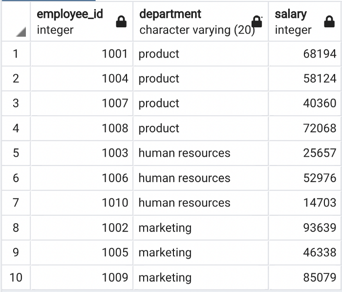
employees table

The employees table contains 10 rows and 3 columns. We can calculate the average employee salary in each department as below:

SELECT
department,
AVG(salary) AS avg_salary
FROM employees
GROUP BY department
The output of the GROUP BY operation above

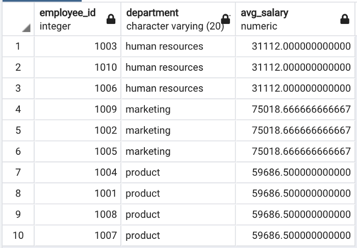
Here is how we calculate the average department salary with a window function:

SELECT
employee_id,
department,
AVG(salary) OVER (PARTITION BY department) AS avg_salary
FROM employees
The output of the window function operation above

The two examples above demonstrate the difference between the GROUP BY operation and window functions.

The window functions are frequently used for ranking as well. For instance, we can assign a rank to each department based on salaries:

SELECT
employee_id,
department,
salary,
RANK() OVER (PARTITION BY department ORDER BY salary DESC) AS
salary_rank
FROM employees
The output of the window function operation above

The rank of the employee with the highest salary within each group is 1.

After an introduction to SQL window functions, we can start on the main topic of this article: Performing these operations with Pandas.

Pandas is a data analysis and manipulation library for Python. Thanks to its highly practical functions and methods, Pandas is one of the most popular libraries in the data science ecosystem.

SQL window functions can easily be replicated with Pandas. Let’s start with the first example where we calculated the average employee salary for each department.

The first step is to import Pandas and create a DataFrame by reading the employees CSV file.

import pandas as pdemployees = pd.read_csv("Downloads/employees.csv")employees.head()
The first 5 rows of the employees DataFrame

We can calculate the average salary by department as follows:

employees["avg_salary"] = employees.groupby("department")["salary"].transform("mean")

What the above code does is:

  • Group the rows based on the department
  • Calculate the average salary value of the rows in each group
  • Create an avg_salary column with the calculated average values

You may have noticed that we call the mean function using the transform function. If we apply the mean function directly, the output will not have the same shape as the current DataFrame so it cannot be used for creating a new column. The transform function produces an output with the same axis shape as the DataFrame. This is valid for all aggregations used within a “group by” operation.

Here is the employees DataFrame after this operation:

The employees DataFrame

We can do the rank example similarly:

employees["salary_rank"] = employees.groupby("department")["salary"].rank(ascending=False)employees
The employees DataFrame

The rank function assigns the rank in ascending order by default. In order to make the highest one rank first, we need to change the value of the ascending parameter to False.

The other SQL window functions can be replicated with Pandas as well. The logic is the same, only the name of the function changes. For instance, LEAD and LAG are commonly used SQL window functions as well. They are used for getting the values from the next or previous rows, respectively. We can perform the same operation with Pandas by using the shift function.

.

87

1

Python Pandas commands for EDA

This commands is a must when you working /using Pandas for Analysis……..

# imports
import random
import time
import os
import pandas as pd
import seaborn as sns
import numpy as np
from scipy import stats as sts
import matplotlib.pyplot as plt
a4_dims = (11.7, 8.27)
plt.rcParams['figure.figsize'] = a4_dims

import warnings
warnings.filterwarnings('ignore')

#to display all rows columns 
pd.set_option('display.max_rows', None)
pd.set_option('display.max_columns', None)  
pd.set_option('display.expand_frame_repr', False)
pd.set_option('max_colwidth', -1)

# to remove scientific notation
pd.set_option('display.float_format', lambda x: '%.3f' % x)

#timing your program?
import time
start = time.time()
# your code here
end = time.time()
print(end - start)


# working with date time
# convert a col to datetime pandas
df['date'] = pd.to_datetime(df['date'])

#Change working directory
import os
os.getcwd()
os.chdir("directory")

%pwd
%cd folder

# get df value
df['col'][1].item()

# create empty df with n cols & m rows
#read excel
pd.read_excel('.xlsx', sheet_name = 'Sheet1')

# remove index while exporting
df.to_csv('csv', index = False)

#importing multiple files in a directory
l = [pd.read_csv(filename) for filename in glob.glob("path\*.csv")]

df = pd.concat(l, axis = 0)df = pd.concat(l, axis = 1)

df = df1.append(df2)axis - 0 row - 1 col

df = pd.merge(df1, df2, on = 'com_col', how = 'outer')
#index reset
df.reset_index(drop = True, inplace = True)

#change dtype
df.Weight = df.Weight.astype('int64')

#replace blanks with NaN
df.replace(r'^\s*$', np.nan, regex=True)

#accepts only 1D , get all unique elements in a column 
pd.unique(df['col1'])
df['col1'].unique()

#to flat 2D into 1D
df[['col1', 'col2']].values.ravel()

#to flat 2D into 1D & get only unique values
pd.unique(df[['col1', 'col2']].values.ravel())

#number of unique elements in one column
df['col1'].value_counts()

#number of unique elements in all columns
df.nunique()

#missing values
sns.heatmap(df.isnull())

# NaNs by col
df.isnull().sum(axis = 0)

#drop a column in df
df.drop(['colname'], axis = 1)

#percentile
df['col'].quantile(0.1)  

#top 10 percentile

#filter columns based on names
col_list = list(df.filter(like = 'Avg_').columns)

#create a sample dataframe
df = pd.DataFrame({'col1': [1,2,3], 'col2': [11,22,33]})
df = pd.DataFrame({'x': [1,2,3], 'y':[11,22,33]}, columns = ['x1', 'y1'])

#with n cols & rows
pd.DataFrame(index=np.arange(1), columns=np.arange(8))

#sorting values by 1 col
df.sort_values(by = ['col1'], ascending = True)

#sorting values by more columns
df.sort_values(by = ['col1', 'col2', 'col3'], ascending = True)

#renaming the columns
df.rename(columns = {'col1':'rnm1', 'col2':'rnm2'}, inplace = True)

#column slicing
all = df.columns
except last one = df.columns[:-1]
mirror columns = df.columns[::-1]

#filter function
df.filter(['col1', 'col2', 'col3'])
df.filter(regex = '/d')

#upto 2 place decimal
 "{:.2f}".format(x)

#row slicing
#top 4 rows
df[:4]#col slicing
df[(cond1) | (cond2) & (cond3)]    #where cond1 = df['col1'] > 2

#iloc & loc
df.iloc[<index>, <index>]
df.loc[(cond1), ['col1', 'col2']] 

#where cond1 = df['col1'] > 2#groupby
df.groupby(by = ['col1'])['reqcols'].mean()

#replacing nan with space
df['col1'] = df['col1'].replace('whattoreplace', 'replacewith')
df = df.replace('','')
df = df.fillna('')

#drop rows with nan
df.dropna()#converting string to datetime
df['col1'] = pd.to_datetime(df['col1'])

#summary & transpose
df.describe().transpose()

#check for null values in a column
df.isnull().any()
df.isnull().all()
df['col1'].isnull()
df['col2'].notnull()

#null values in each col
df.isna().sum()

#check for non-null values
pd.notnull()

#isin in pandas
df['col1'].isin('somelist')

#dropping duplicates
#drops duplicates excluding first occurence
df.drop_duplicates()

#drops duplicates excluding last occurence
df.drop_duplicates(keep = 'last')

#drops duplicates by col

df.drop_duplicates(['col1'])
df.drop_duplicates(['col1'], keep = 'last')
df.drop_duplicates(subset = 'Col1')

#joining dataframes#Creating a pivot
df.pivot('A', 'B', 'C') - [A - vertical, B - Horizontal, C - values]
pd.pivot_table(df, values = '', index = ['',''], columns = [''], aggfunc = np.sum)

#Unpivot
pd.DataFrame(pivoted.to_records())

#replace infinity with nan
df.replace([np.inf, -np.inf], np.nan)

#check for infinite values 
np.isfinite(df).any()

#data types of all columns
df.dtypes
#data type of a single column
df.colname.dtypes
#convert dtypes
df['col'].astype(str).astype(int)

#lambda function
lambda x : x + 10

#applying functions to a dataframe
df.apply(lambda x: x + 3)


#apply function referencing multiple columns
df['Value'] = df.apply(lambda row: my_test(row['a'], row['c']), axis=1)
#if else loop in a lambda function
df.apply(lambda x: 1 if x == 'W' else 0)

#List Comprehensions
ls = [i for i in ls1 if i not in ls2]

#numpy array methods
np.zeros((shape))
np.ones((shape))
np.full(5, -1)
np.full((2,5), -1)

#list methods
list.sort()
list.sort(reverse = true)
ls = ['a','b','c']
"".join(ls) = abc
"-".join(ls) = a-b-c

#reverse a list
list.reverse()
#remove list items
list.clear()
#remove - removes the element from the list
ls.remove(element)
list.pop[0]

#pop - last element
ls.pop()
#pop at index
ls.pop(0)
del list[0]
#get list index
list_name.index('element')

#append - adds an element to the list
ls.append(element)

#extend - adds ls2 to the end of ls1
ls1.extend(ls2)

#insert
ls.insert(position, element)

#delete - deletes the element at that index
del ls[0]
del ls[:] 

#deletes all elements from the list#enumerate
enumerate(iterable, start)
li = ['a','b','c']
ob = enumerate(li)

#String methods
str.endswith('pattern')


5 SQL Commands You Need to Know as a Beginner Starting Out

5 basic commands you’ll need to know if you want to be proficient in SQL

SQL is a powerful language that can be used for all sorts of data analysis tasks.

It’s also a perfect fit for people who want to get into coding because it’s so similar to many other programming languages.

In this article, we’ll break down 5 SQL commands you need to know to get started along with examples so that by the end, you’ll know enough about SQL to start using it on your own projects!

1. SELECT

The first command you need to know if you’re starting in SQL is SELECT. It’s the most basic command in SQL and is used to get data from a table.

Some uses of SELECT include:

  • Selecting all of the data from a table
  • Selecting specific columns from a table
  • Selecting data based on certain criteria (using WHERE)

Examples:

SELECT * FROM tablename

This will give you all of the data from the tablename table. You can also select specific columns by specifying their name after SELECT:

SELECT id, name FROM tablename

This will give you the id and name columns from the tablename table.

SELECT DISTINCT

If you want to select only unique values, you can use SELECT DISTINCT. This command removes duplicate values from the results:

SELECT DISTINCT id FROM tablename

This will give you a list of all the unique ids from the tablename table.

SELECT COUNT

The SELECT COUNT command returns the number of rows in a table:

SELECT COUNT(*) FROM tablename

This will return the total number of rows in the tablename table. You can also count specific columns

2. WHERE

WHERE is another very common command in SQL. It’s used to filter the data that appears in a SELECT statement:

Some uses of WHERE include:

  • Filtering data by a certain column
  • Filtering data by a certain value
  • Filtering data by date range

Examples:

SELECT * FROM tablename WHERE id = 100

This will return only the rows from the tablename table where id equals 100. Multiple conditions can be specified using AND or OR:

SELECT * FROM tablename WHERE (id = 100) OR (name = ‘John’)

This would return all of the rows from the tablename table where either id=100, or name=’John’.

SELECT * FROM tablename WHERE id BETWEEN 100 AND 200

This would return all of the rows from the tablename table where id is between 100 and 200.

SELECT * FROM tablename WHERE id NOT IN (100,200)

This would return all of the rows from the tablename table where id is not equal to 100 or 200.

3. ORDERBY

ORDERBY is also commonly used in SQL. It’s used to sort the results of a SELECT statement. These results can either be sorted by descending order or ascending.

Some uses of ORDERBY include:

  • Sort results in ascending order: SELECT * FROM tablename ORDERBY id
  • Sort results in descending order: SELECT * FROM tablename ORDERBY id DESC
  • Sort results alphabetically: SELECT * FROM tablename ORDERBY name
  • Sort results by date: SELECT * FROM tablename ORDERBY created_at

Examples:

SELECT * FROM tablename ORDER BY name

This would return all of the rows from the tablenname table and order by their names. If you want to use multiple columns for sorting, specify them in an comma-separated list:

SELECT * FROM tablename WHERE id > 100 ORDER BY age DESC, name ASC

This will give us all of the rows where ID is greater than 100 and will order those values by descending age first, then ascending name second.

4. GROUPBY

GROUPBY is a statement in SQL used to group the data in a SELECT statement by a certain column.

Some uses of GROUPBY include:

  • Summarizing data
  • Finding the max or min value for a column
  • Getting the average, median, or standard deviation for a column

Examples:

SELECT id, name, SUM(age) AS “Age” FROM tablename GROUP BY id

This will return a table with three columns: ID, Name, and Age. The Age column will have the sum of all the age values in the tablename table grouped by ID.

SELECT max(age) as “Oldest Person” from tablename GROUP BY id

This will return a table with one column: Oldest Person. The Oldest Person column will have the max age value from the tablename table grouped by ID.

SELECT avg(age) as “Average Age” from tablename GROUP BY id

This will return a table with one column: Average Age. The Average Age column will have the average age value for all rows in the tablename table, grouped by ID.

5. LIKE

The LIKE operator is used to match a pattern in a character string. The percent sign (%) is used as a wildcard character, which means that it can represent any number of characters.

Some uses of LIKE include:

  • Matching a pattern in a column
  • Finding specific values in a column

Examples:

SELECT id, name FROM tablename WHERE name LIKE ‘A%’

This would return all of the rows where the first column (name) contains the letter A at least once.

SELECT id, name FROM tablename WHERE name LIKE ‘%end’

This would return all of the rows where there are columns named “end”.

SELECT * FROM tablename WHERE name LIKE ‘John%’

This will return all of the rows from the tablename table where the name column contains the string John followed by any number of characters (%). The % can be used at the beginning, end, or anywhere in the string.

Start Mastering SQL

The SQL commands we’ve discussed in this blog post are powerful tools that can help you get the most out of your data.

Use these commands to help you analyze and optimize your data, and you’ll be well on your way to mastering SQL.

atoti — Build a BI Platform in Python-an interactive UI

Motivation

Have you ever taken 15 minutes or so just to manipulate the data and create a plot in Python? Wouldn’t it be nice if you can quickly extract insights from data by simply dragging and dropping like below?

That is when atoti comes in handy. In this article, you will learn how to quickly create a dashboard in Python and share it with others using atoti.

What is atoti?

atoti is a free Python BI analytics platform for data scientists, data analysts, and business users.

With atoti, you can quickly:

  • Create different scenarios and compare them side by side
  • Create and gain insights from a multi-dimensional dataset
  • Share results with your coworkers and stakeholders
  • Create interactive visualization on Jupyter lab without coding

and more.

To install atoti, type:

pip install atoti[jupyterlab]

Now when you open a Jupyter lab by running:

jupyter lab

You should see the atoti icon in the left panel.

Create a Cube

To learn how atoti works, let’s use it to analyze the Data scientist salary dataset on Kaggle.

Start with creating a session. The config argument is optional but is important if you want to save your dashboard or share it with others. Specifically,

  • user_content_storage specifies the location where the dashboard is stored
  • port specifies the port number for the dashboard app. If port is not specified, atoti will choose a random port.
import atoti as tt

session = tt.create_session(
    config={
        "user_content_storage": "./content",
        "port": 9000,
    }
)

Create a DataFrame by reading data from a CSV

df = session.read_csv("data_cleaned_2021.csv")
df.head()

Next, create a cube:

cube = session.create_cube(df)

https://pub.towardsai.net/media/d1c64630e44c908857d84d83e8892df2

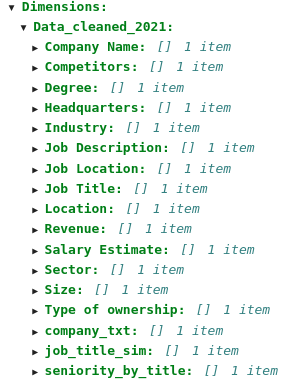
A cube is a multidimensional view of your data, making it easier to aggregate, filter, and compare. It is called a cube because each categorical column of the data can be represented as a dimension of the cube:

A cube consists of 2 components: dimensions and measures.

If you want to change this default, add hierarchized_columns to
 session.read_csv()
df = session.read_csv(“data_cleaned_2021.csv”, hierarchized_columns=[…])
Now, let’s try to interact with this cube on the atoti dashboard.


Create a Dashboard
To create a dashboard with atoti, simply type:
session.visualize()


Let’s use atoti to get some interesting insights from our data.

Salary by State

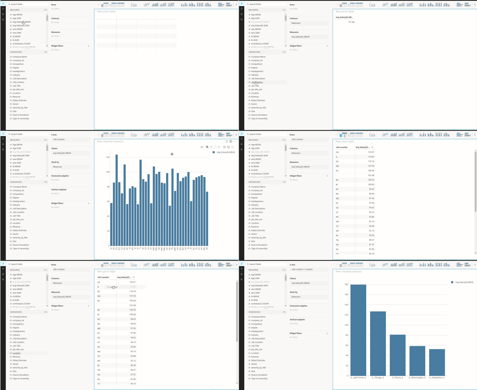
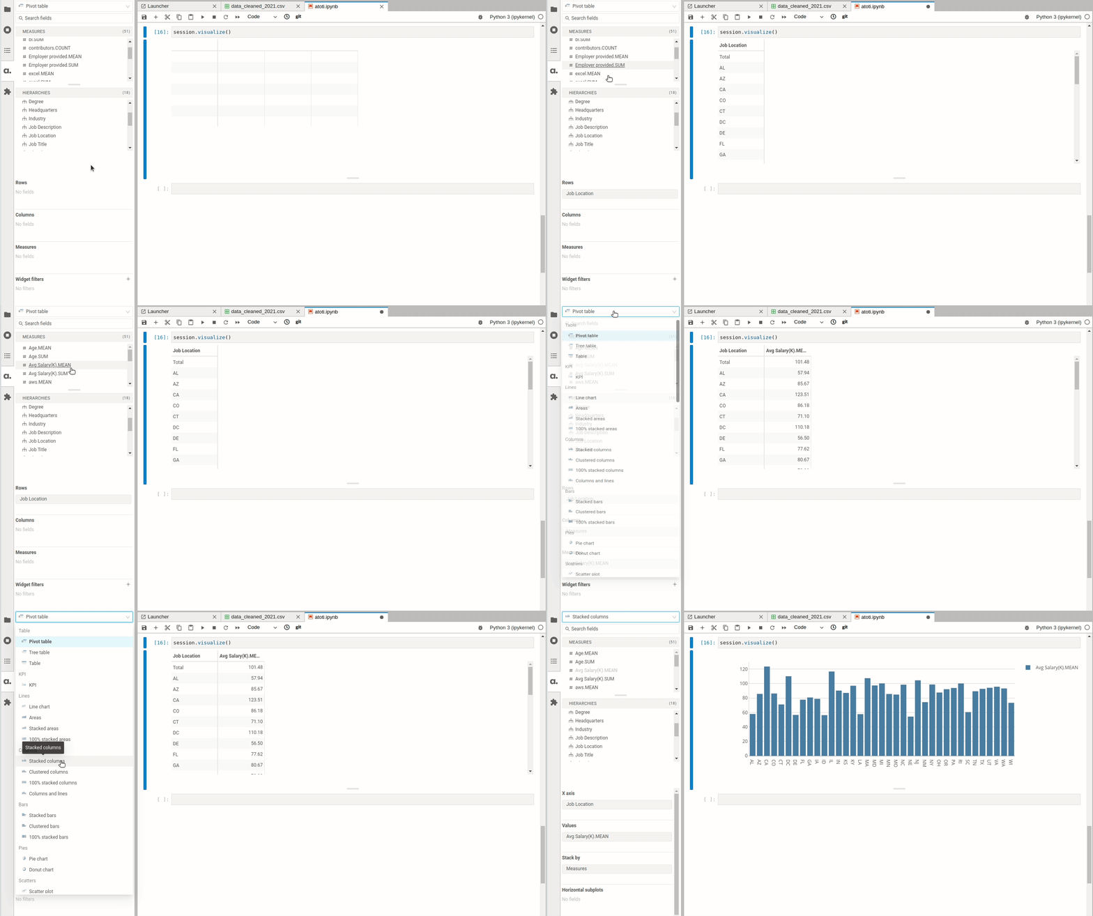
First of all, what is the average salary by the state? That can easily be found by clicking Job Location in the Hierarchies session and clicking Avg.Salary(K).MEAN in the Measures session.

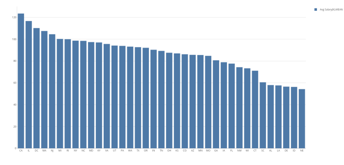
Once the pivot table is created, you can click one of the charts on the top panel to create a chart based on the table.

From the bar plot, it seems like the mean salary of data scientists is the highest in California, Illinois, District of Columbia.

Salary by City within a Specific State

So far we only know salary by state. However, you might care more about salary by the city since salary can vary a lot between cities within a state.

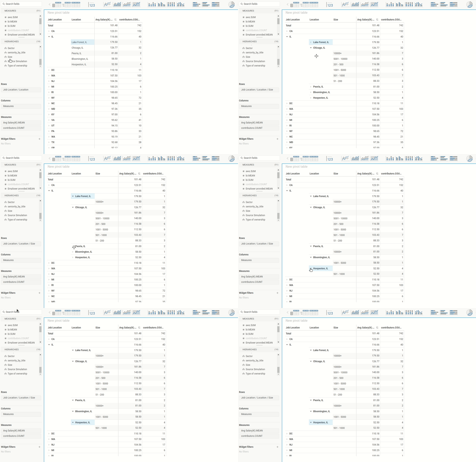
Let’s figure out the salary by the city in Illinois by dragging the Location tab to the value IL .

Hah! Interesting. The mean salary in Lake Forest, IL is higher than the mean salary in Chicago, IL. Since Chicago is a bigger city with a higher cost of living, it seems a little bit odd to see that the mean salary in Chicago is smaller than the mean salary in Lake Forest, IL.

Could it be that there are not enough data points at Lake Forest to accurately represent the population? Let’s add contributors.COUNT to the table to find out how many data points there are per city.

Aha! There is only one data point at Lake Forest, IL while there are 32 data points at Chicago, IL. One data point at Lake Forest is not enough to generalize about the salary of the population at Lake Forest.

Find the Factors that Affect the Difference in Salary

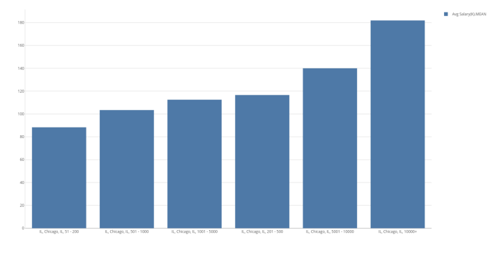
Is there a way we can explain the difference in salary in the same location? It could be that bigger companies pay more to their employees. Let’s check our hypothesis by adding Size to the table.

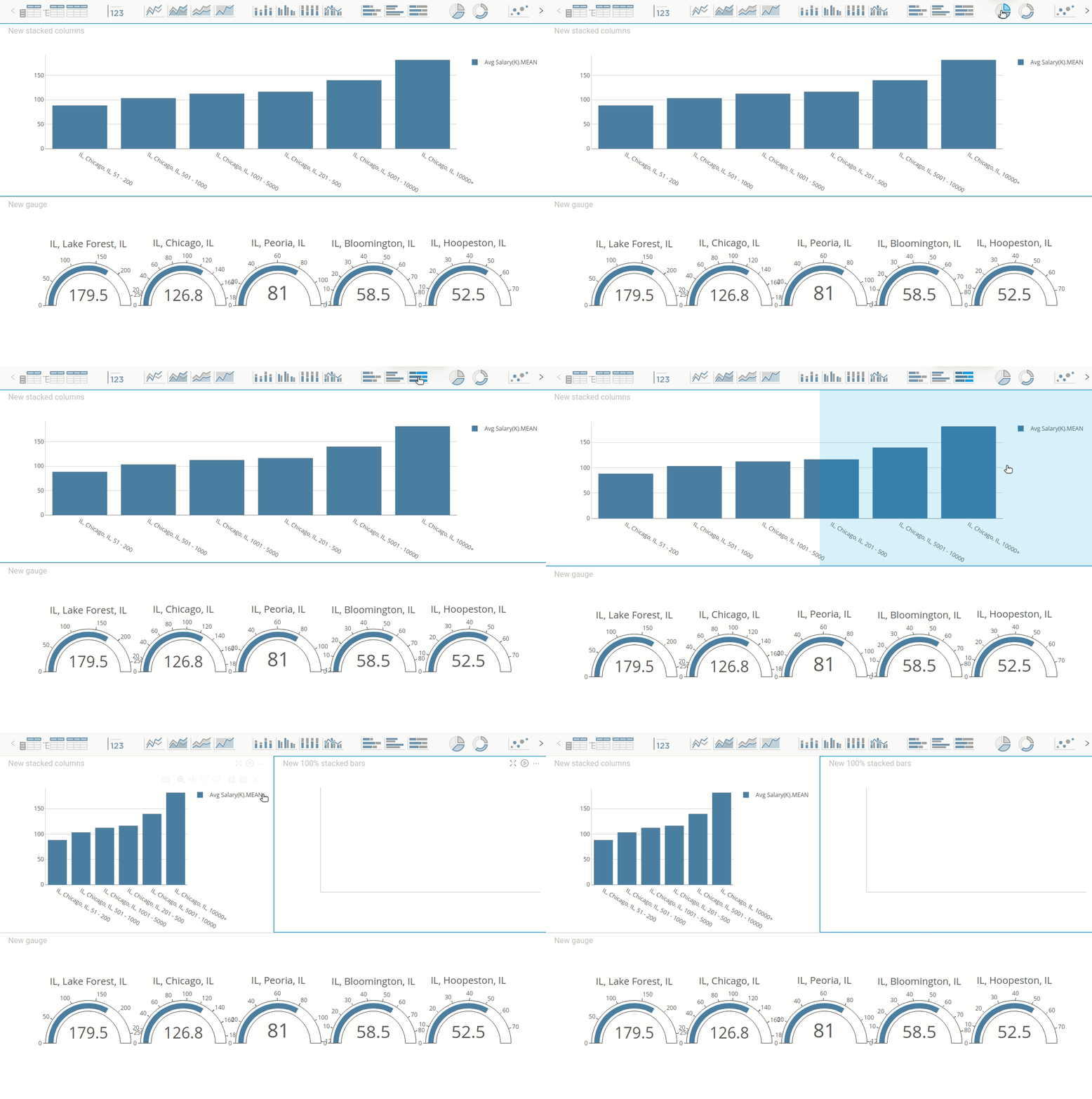
The hypothesis seems to be correct. As the company size increases, the salary increases. Let’s visualize this relationship in Chicago, IL using a bar chart:

Cool!

Analyze Degrees Per Job Title Using a Stacked Bar Chart

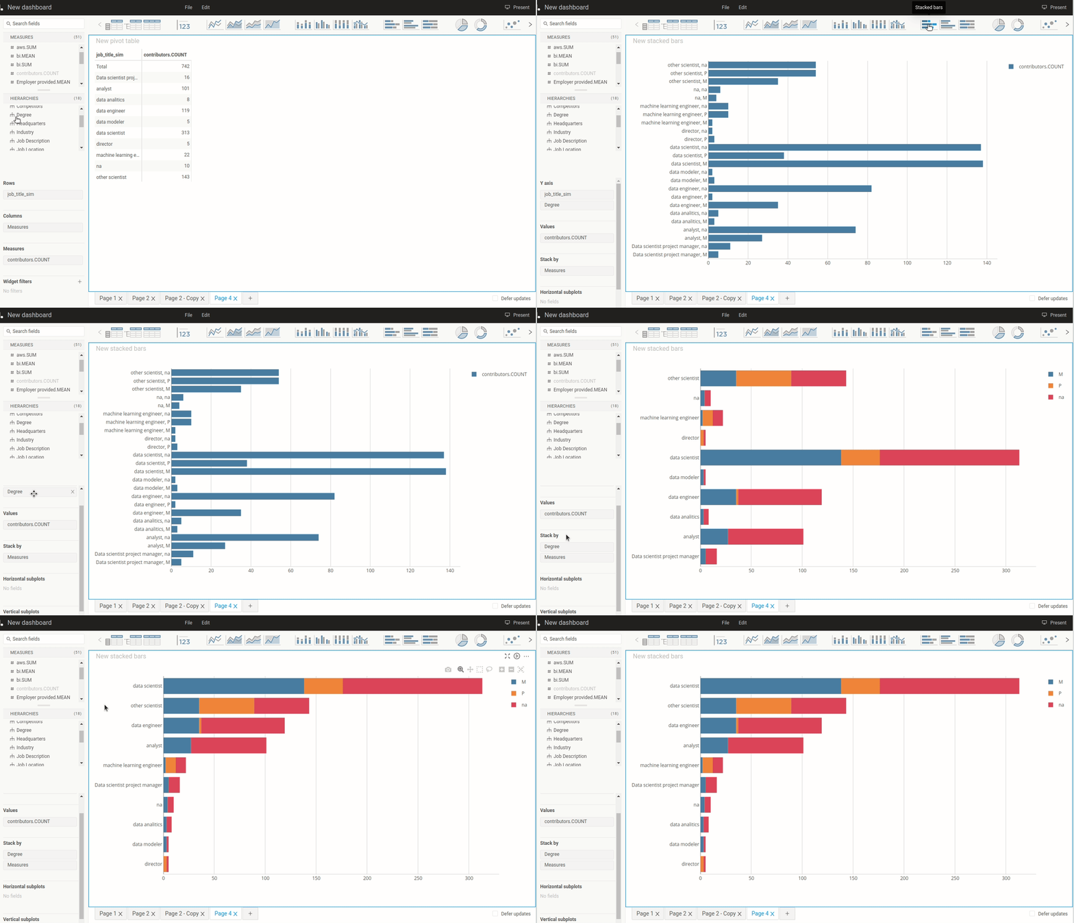
So far, we have only aggregated a numerical column by one categorical column. Let’s aggregate a numerical column by two categorical columns and visualize this two-dimensional dataset using a stacked bar chart.

Stacked bar charts are useful for comparing parts of a whole.

Note that initially, a chart is not stacked. To stack the chart by Degree, drag Degree to the Stack by region.

In the stacked bar chart above,

  • The blue bars represent a Master’s degree.
  • The orange bars represent Ph.D. degrees.
  • The red bars represent NaN. We can assume that these are people who don’t have either a Master’s degree or a Ph.D. degree.

It can be hard to compare the percentage of Ph.D. between different job titles since the count of each title is different. Let’s convert a normal stacked bar chart to a 100% stacked bar chart for comparison:

Image by Author

From the 100% stacked bar chart, it seems like a Ph.D. degree is common among machine learning engineers, data scientists, directors, and other scientists.

TreeMap and Filter

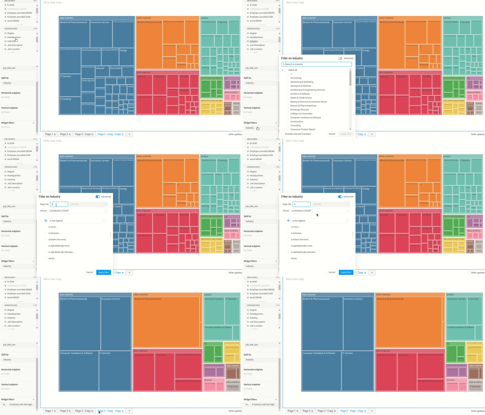
What industries do most data professionals work in? To answer this question, we create a 2-dimensional dataset whose dimensions are job_title_sim and industry and measure is countributor.Count .

Next, click the treemap icon to create a treemap. Treemaps are ideal for displaying data that is grouped and nested in a hierarchical structure.

Since there are many industries in one title, it is hard to read the treemap. Is there a way that we can show only the 4 most common industries per title? Yes, we can do that with Widget filters.

To choose the 4 most common industries, drag Industry to Widget filters and click Advanced.

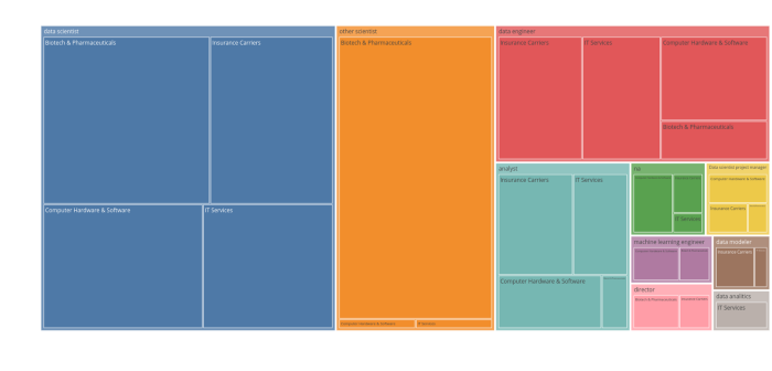
Nice! Now the treemap looks much easier to read. From the treemap below, we can see that the common industries among most data professionals are:

  • Biotech & Pharmaceuticals
  • Insurance Carriers
  • Computer Hardware & Software
  • IT Services

Multiple Charts in One Dashboard

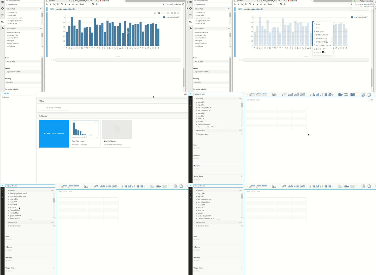
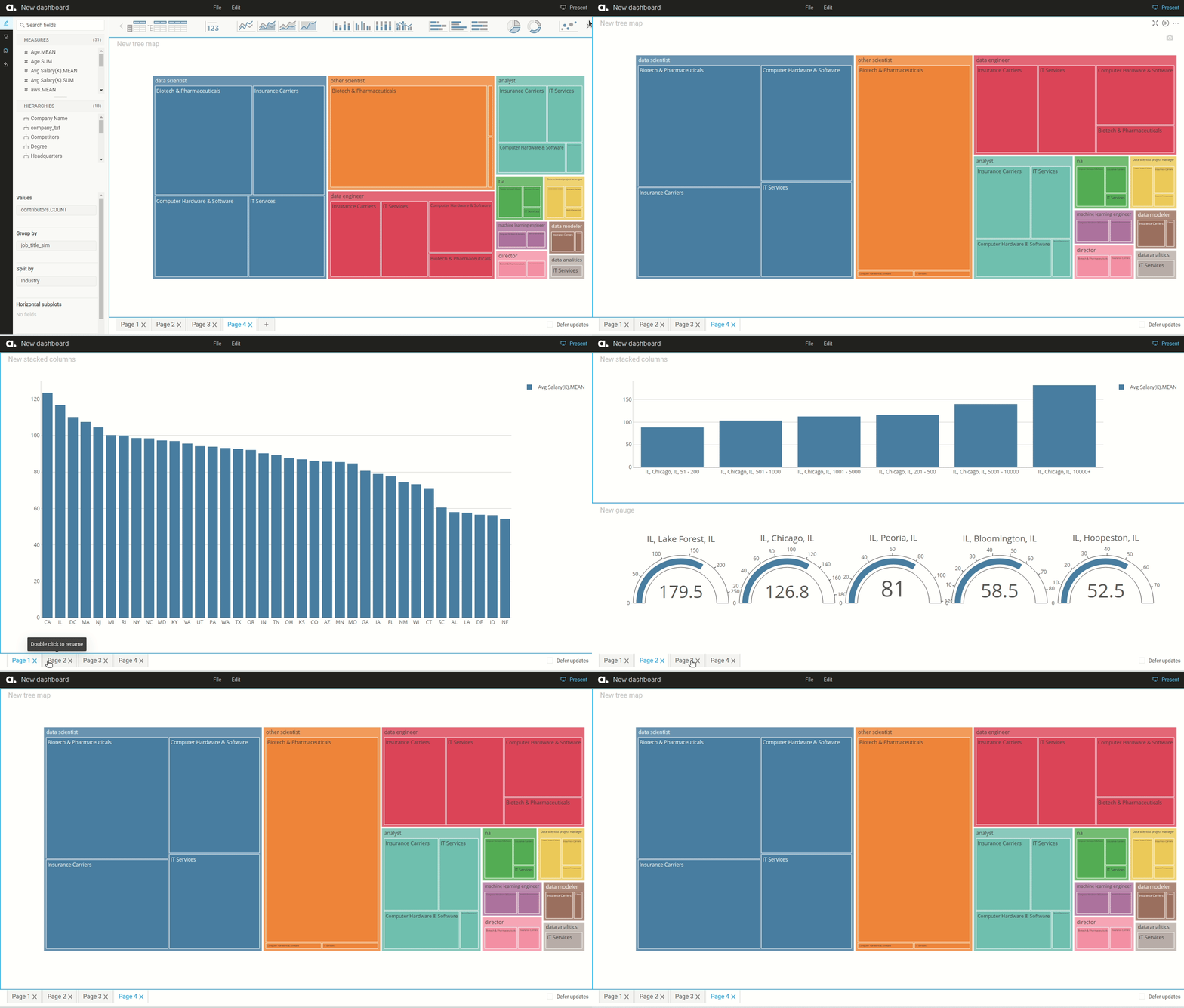
To add multiple charts in one dashboard, you either add a new page:

Or drag another chart component to the same page:

Present and Share Your Dashboard

Okay, it is cool to be able to create a dashboard in your local machine. But what if you want to share your findings with others? Luckily, atoti also makes it easy to present and share your dashboard.

Present Your Dashboard

To present your dashboard, simply click the Present button in the top left of the screen. atoti will hide all Edit panels and only show the charts in your dashboard.

Share Your Dashboard

Your dashboard looks amazing, and you want your coworkers to have an opportunity to interact with your dashboard. How do you share your dashboard with them?

Right now, your dashboard is in your local machine:

http://localhost:9000/#/

To turn your local web server into a public URL, use ngrok. Start with installing ngrok and set it up.

If your current port is 9000, type:

$ ngrok http 9000

… and a public URL will be automatically generated for you!

Now all you need is to send the public URL link to your coworkers so they can view it. Note that when you end the session in your local machine, your coworkers will no longer be able to view the dashboard.

Check out this tutorial on how to make your session more secure and this tutorial on how to deploy your dashboard.

The Basic Fundamentals of Data Preprocessing

Pre-processing refers to the transformations applied to our data before feeding it to the algorithm. Data Preprocessing is a technique that is used to convert the raw data into a clean data set.

Step 1: Importing the required libraries

Numpy: It is a library that contains Mathematical functions.

Pandas: It is a library used to import and manage datasets.

Step 2: Importing the dataset

Datasets are generally available in .csv format. A CSV file stored tabular data in plain text. We use the read_csv method of the pandas library to read a local CSV file as a DataFrame.

Step 3: Handling the Missing Data

The missing values in the data need to be handled so that it does not reduce the performance of our Machine Learning model. We can replace the missing data by Mean or Median of the entire column. We use the Imputer class of sklearn.preprocessing for this task.

Step 4: Encoding Categorical Data

Categorical data are variables that contain label values rather than numeric values. To achieve this, we import the LabelEncoder class from sklearn.preprocessing library.

Step 5: Splitting the dataset into training and testing

We make two partitions of the dataset, one for training and the model called training set and the other for testing the performance of the trained model called the test set. The split is generally 80/20.

Step 6: Feature Scaling

Most of the Machine Learning algorithms use the Euclidean distance between two data points in their computations, features highly varying in magnitudes. Done by Feature standardization or Z-Score normalization. StandardScaler of sklearn.preprocessing is imported.

And there you have it.

A Pandas / Bamboolib GUI

if you are someone who is already working in the domain of data and often come across scenarios where you have to use pandas either for your EDA or for performing some sort of analysis. The bottom line is, we all use pandas one way or the other routinely, and why not? After all, it makes life a LOT easier. What if I told you that there is a GUI version for pandas that can make life even better!

Bamboolib is transforming the way we analyze experimental data, allowing everyone on our team to quickly wrangle highly complex datasets in a reproducible manner. Along the way it also teaches best practices to novice coders and avoids wasted time digging through online forums. This is the missing link that we’ve been waiting for to move our analytics workflows out of spreadsheets without sacrificing speed or flexibility.

Getting Started

In this article, we will explore bamboolib and get a deeper insight into its performance.

Disclaimer: a lot can be accomplished via bamboolib but I’ll only be covering some of its salient features to make you understand what this library is in a nutshell.

In order to get started with bamboolib, all you need is a good old-fashioned PIP command to install it. Open terminal or Jupyter notebook and type:


pip install bamboolib

Importing the library and getting started with it

In order to use bamboolib import the library as:

import bamboolib as bam

and you’re done! Now load the data as you normally would with pandas and once the data is loaded (assuming you’ve loaded the CSV in a variable called data) all you have to do in order to get started with bamboo lib is as simple as typing:

 bam.show(data)

For purpose of a demo, I have done the process on the publicly available data of properties provided by zameen.com. The initial show command will reveal something like this:

As you can see, this is just the initial data frame shown. Here we have two options; either we can create a plot feature in bamboolib which will help us to create various plots over our data frame OR we can choose to go with Explore DataFrame for EDA.

Create Plot

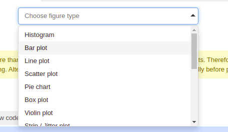
The create plot feature is one of the most amazing features of bamboolib. It allows you to create one of many plots with just a few clicks. Let’s see how easily this can be done. As soon as we click on create plot we get multiple options for graphs. These graphs are not only limited to conventional 2D graphs but also allow us to use 3D graphs. Below are a few of the options for graphs:

Let’s say we want to create a graph to see the comparison between prices of property between different areas of Islamabad.

It is as simple as selecting “Figure Type” which I have selected as a bar graph, selecting column names for the x and y-axis which I have selected as area and price respectively and that’s pretty much it. Bamboolib does all the work for you.

It even allows you to choose different themes for your plot, scaling factor, log scaling, color themes, order of columns, and opacity, etc.

Impressed yet? Bamboolib even lets you copy the code for your plots by a simple click on the copy code button using which you can even create these beautiful visuals outside your Jupyter notebook.

Wait, there’s more. Here comes bamboolib once again, since the majority of its graphs utilize Plotly, all the graphs created are interactive and you can even create a hover show of data on the graphs. It also allows you to directly save the graph as a png with a single click.

EDA

Now let’s just say that you are not interested in the visuals and are more interested in knowing what kind of data and features that you actually have. No worries, bamboolib got you. This is what you get with a single click on “Explore DataFrame”. Your entire data is explained as you’ve never seen before.

It tells you all the data types along with missing values, percentage of missing values so you can decide for yourself to see if you need to impute the data or drop the column or do whatever you see fit with the data. It also lets you know the unique values in each of the features of your data.

Want to know about just a single feature? Start by checking out the property types in the data. Simply click on the column named property_type or select from the drop-down on top. You’ll get the following results:

Not only does it tell you the unique and missing values but also helps you find the distribution of data along with the percentage of presence of the unique values in that specific column. This also helps you see the count and cumulative percentages. Still not impressed?

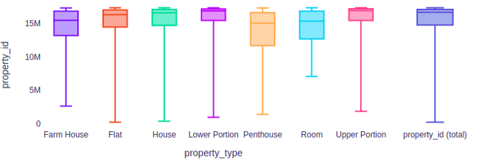
Let’s dive deeper into the selected column, if you click on “Bivariate plots” it’ll show you just what you need to know regarding the distribution of your data. The box plots visually explain the distribution of all the values of your column.

You can even set some predictors here to see how well a column helps to predict another one as a target. In my case, this might not be a good example because of a lot of categorical values but still, I’ll show you the screenshot. Notice that it also indicates the MAE:

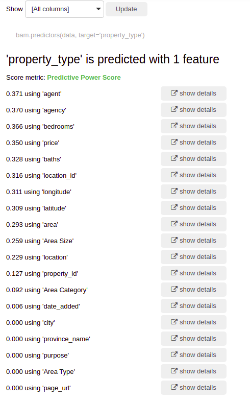
And this doesn’t stop here, we can actually go a step further to see which features help us to predict our current feature and how much they contribute to this:

We can see the details of each to verify for ourselves as I have for the area category.

Correlation Matrix

Last but not the least, bamboolib also enables you to see a correlation between the features using the correlation matrix it generates with a single click:

Conclusion

I might have missed a lot of things but I have covered enough for you to get intrigued and explore on your own. If you find interesting use of the library do write an article and share it with me.

Libraries like bamboolib save a lot of time and make our work a lot easier but still in order to utilize such powerful tools make sure that you have enough baseline knowledge to understand what each graph and stats mean. These tools are brilliant but only when you have got your basics covered and concepts right. For someone who has a strong grip on EDA, you’ll love this.

Thanks for reading.

A Python tool for Data Processing, Analysis, and ML Automation in a few lines of code

Essential guide to dabl library

A data science model development pipeline involves various components including data collection, data processing, Exploratory data analysis, modeling, and deployment. Before training a machine learning or deep learning model, it’s essential to clean or process the dataset and fit it for training. Processes like handling missing records, removing redundant features, and feature analysis are part of the data processing component.

Often, these processes are repetitive and involve most of the model development work time. Various open-sourced Auto-ML libraries automate the entire pipeline in few lines of Python code, but most of them behave as a black-box and do not give intuition about how they processed the dataset.

To overcome this problem, we have an open-sourced Python library called dabl — data analysis baseline library, that can automate most of the parts of the machine learning model development pipeline. This article will cover the hands-on implementation of the package dabl including data preprocessing, feature visualization, and analysis, followed by modeling.

dabl:

dabl is a data analysis baseline library that makes supervised machine learning modeling easier and accessible for beginners or folks with no knowledge of data science. dabl is inspired by the Scikit-learn library and it tries to democratize machine learning modeling by reducing the boilerplate task and automating the components.

dabl library includes various features that make it easier to process, analyze and model the data in a few lines of Python code.

Getting Started:

dabl can be installed from PyPI using

pip install dabl

We will be using the Titanic dataset downloaded from Kaggle for implementation of the library.

(1.) Data Pre-processing:

dabl automates the data preprocessing pipeline in a few lines of Python code. The pre-processing steps performed by dabl include identifying missing values, removing the redundant features, and understanding the features’ datatypes to further perform feature engineering.

The list of detected feature types by dabl includes:

The list of detected feature types by dabl includes:
1. continuous
2. categorical
3. date
4. Dirty_float
5. Low_card_int
6. free_string
7. Useless

All the dataset features are automatically categorized into the above-mentioned datatypes by dabl using a single line of Python code.

df_clean = dabl.clean(df, verbose=1)
(Image by Author), Auto-detected data types for each feature

The raw Titanic dataset has 12 features, and they are automatically categorized into the above-mentioned datatypes by dabl for further feature engineering. dabl also provides capabilities to change the data type of any feature based on requirements.

db_clean = dabl.clean(db, type_hints={"Cabin": "categorical"})

One can have a look at the assigned datatype for each feature using detect_types() function.

(2.) Exploratory Data Analysis:

EDA is an essential component of the data science model development life cycle. Seaborn, Matplotlib, etc are popular libraries to perform various analyses to get a better understanding of the dataset. dabl makes the EDA very simple and saves worktime.

dabl.plot(df_clean, target_col="Survived")

plot() function in dabl can feature visualization by plotting various plots including:

  • Bar plot for target distribution
  • Scatter Pair plots
  • Linear Discriminant Analysis

dabl automatically performs PCA on the dataset and also shows the discriminant PCA graph for all the features in the dataset. It also displays the variance preserved by applying PCA.

(3.) Modeling:

dabl speeds up the modeling workflow by training various baseline machine learning algorithms on the training data and returns with the best-performing model. dabl makes simple assumptions and generates metrics for baseline models.

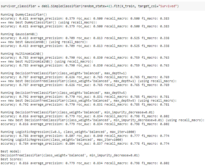
Modeling can be performed in 1 line of code using SimpleClassifier() function in dabl.

(Image by Author), Performance metrics for baseline modeling using dabl

dabl returns with the best model (Decision Tree Classifier) in almost no time. dabl is a recently developed library and provides basic methods for model training.

Conclusion:

Dabl is a handy tool that makes supervised machine learning more accessible and fast. It simplifies data cleaning, feature visualization, and developing baseline models in a few lines of Python code. dabl is a recently developed library and needs a lot of improvement, and it’s not recommended for production use.

Exploratory Data Analysis

Exploratory Data Analysis(EDA) is the process of understanding and studying the data in detail to discover patterns, spot anomalies and outliers to maximize the insights we derive from the data set. We use data visualization techniques to recognize patterns and draw inferences that are not readily visible in the raw data.

EDA helps in selecting and refining the important features which would be used by machine learning models .

Purpose of EDA

  • Gain maximum insight into the dataset
  • To identify the various characteristics of data
  • Identify missing values and outliers
  • List the anomalies in the dataset
  • Identify the correlation between variables

Steps in EDA

In order to perform EDA, it’s good to structure your efforts using the below steps.

1.Data Sourcing

  • Import and read the data.

2. Data Inspection

  • Check for null values, invalid entries, presence of duplicate values
  • Summary statistics of the dataset

3. Data Cleaning and manipulation

  • Appropriate rows and columns
  • Take a call to either Impute or remove missing values using the context of the data set
  • Handle Outliers
  • Standardize Values
  • Data Type conversions

4. Analysis

  • Univariate Analysis
  • Bivariate Analysis
  • Multivariate Analysis

Libraries required to perform EDA

In this writeup, i will be using the below python libraries to perform EDA:

  1. Numpy — to perform numerical & statistical operations on a data set
  2. Pandas — makes it incredibly easy to work on large datasets by creating data frames
  3. Matplotlib & Seaborn to perform data visualization and develop inferences

Data Sourcing

Importing the dataset

Pandas is efficient at storing large data sets. Based on the filetype of your dataset, functions from pandas library can be used to import the dataset.

Some of the commonly used functions in pandas are: read_csv, read_excel, read_xml, read_json

Below is an example to read a csv file using pandas library

Understanding the data

  1. Check for the shape of the dataset — This gives us a view of the total number of rows and columns.

2. You also need to ensure appropriate data types are loaded into the dataframe. To do so, you can list the various columns in the dataset and their data types using the .info method.

I have passed verbose = True to print the full summary

3. Identifying missing values

Large datasets usually have missing values and it’s important to handle these before we proceed with detailed analysis. You can check for the percentage of missing values by summing up all the NULL values ( by using .isnull().sum() ) and dividing it by total rows. I have used .shape and the 0 position in the tuple.

4. Summary Statistics

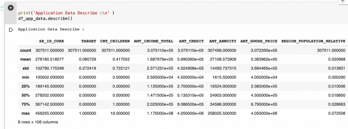
To get a good sense of the numerical data points, we can use the describe function.

This helps us get a feel for the data by studying values like standard deviation, min,max,mean, quantiles (25, 50,75)

Data Cleaning

1.Dropping Rows/Columns

Columns with large amount of missing values, say more than 40–50% null values, can be dropped

If the missing values for a feature are very low, we can drop rows that contain those missing values.

2. Imputing missing values

Process of estimating the missing values and filling them is called imputation. When the percentage of missing values is relatively low and you can impute the values.

There is no one right way to impute the missing value and you would have to decide based on the context of data, reasonable assumptions and assess the implications of imputing the missing values. Some of the ways you could go about imputing are the following ways:

  • For categorical variables, we could impute missing value with the dominant category i.e using the mode
  • For numerical variables, we could impute the missing values with mean/Median. Median is preferred when there are outliers in the data set as median would take the middle value of the dataset.
  • Sometimes it is also good to just impute the missing values with a label like “Missing” for analysis depending on the percentage of null values in the columns

3. Handling Outliers

Outliers are values that are numerically distant from the rest of data points.

Some of the various approaches to handle outliers are:

  • Deletion of Outlier values
  • Imputing the values
  • Binning of values into categories
  • Capping the values
  • Performing a separate outlier analysis

Below is an example of how to slice the data into bins and create a new column in t the dataframe.

4. Standardizing values

  • All the values in a feature should be of a common and consistent unit.
  • We could standardize precision. For eg. numerical values could be rounded off to two decimal places.

5. Data Type conversions

All the features should be of correct data type. For eg. numerical values could be stored as strings in the dataset. We would not be able to get the min, max, mean, median etc for strings.

Now that we have cleaned the data, it’s ripe for analysis. This is where the fun begins and we can perform different types of analysis to spot patterns and identify feature we will later on use to build a model

Univariate Analysis

In univariate analysis, we visualize a single variable and get summary statistics

Summary Statistics include:

  • Frequency distribution
  • Central Tendency — Mean, median, mode, max, min
  • Dispersion — variance, standard deviation and range

Univariate analysis should be done on both numerical and categorical variables.Plots like bar, pie, hist are useful for univariate analysis.

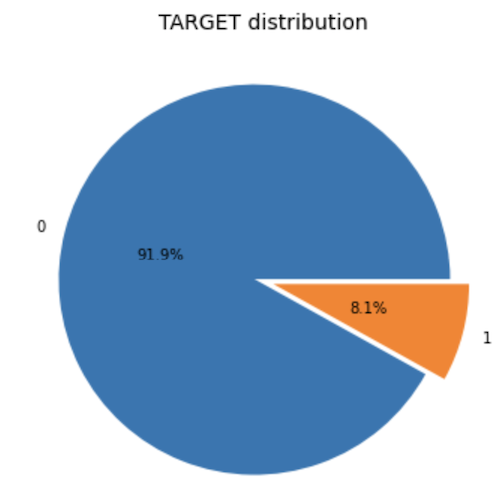
Pie Chart

Below is an example to create pie chart

Using functions to perform univariate analysis

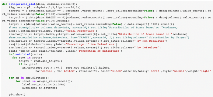
To avoid repeated lines of code and save time, I created functions which would perform univariate analysis of categorical and numerical variables.

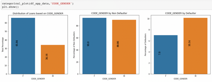
Below is an example of the function for categorical variables which plots the total percentage of values, percentage of defaulters and non defaulters split by TARGET variable for my case study:

Below is an example of the function for numerical variables

Bivariate and Multivariate Analysis

Bivariate analysis involves analyzing two variables to determine the relationship between them. Using Bivariate analysis, we can determine if there is a correlation between the variables.

Multivariate analysis involves analysis of more than two variables.The goal is to understand which variables influence the outcome and the relationship of variables with each other.

We could use various plots like scatter plot, box plot, heatmap for analysis.

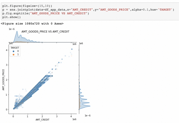
Joint plots

Below is an example of bivariate analysis which shows a positive correlation:

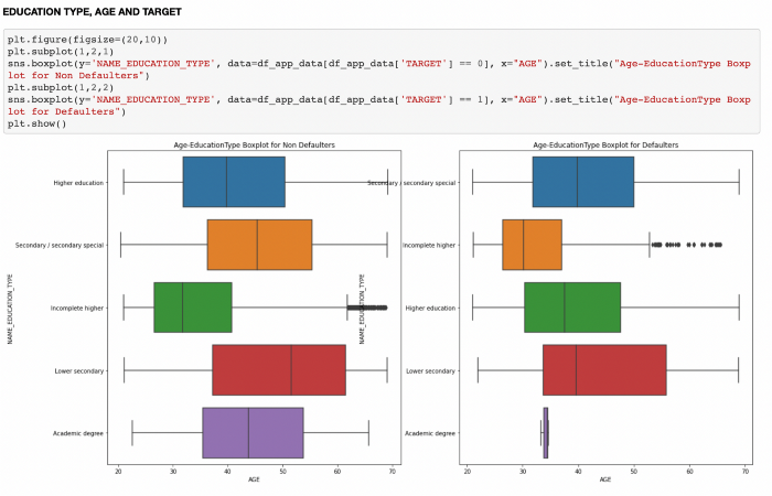
Box and whisker plot

Below is an example of bivariate analysis using boxplot:

Boxplot used with Stripplot and Hue

Below is an example of multivariate analysis. Here, we segment the data based on various scenarios and draw insights using multivariate analysis.

Heatmaps

Heatmaps are powerful and help visualize how multiple variables in our dataset are correlated.

Correlation coefficients indicates the strength between two variables and its values range from -1 to 1.

1 — indicates strong positive relationship

0 — indicates no relationship

-1 — indicates strong negative relationship

Below is an example of a function which plots a diagonal correlation matrix using heatmaps.

Conclusion:

In this writeup I have explained the various steps for performing Exploratory data analysis using Python code.

Automatic Hyperparameter Tuning with Sklearn Using Grid and Random Search

Grid and Random Search vs. Halving Search in Sklearn

What is a hyperparameter?

Today, algorithms that hide a world of math under the hood can be trained with only a few lines of code. Their success depends first on the data trained and then, on what hyperparameters were used by the user. So, what are these hyperparameters?

Hyperparameters are user-defined values like k in kNN and alpha in Ridge and Lasso regression. They strictly control the fit of the model and this means, for each dataset, there is a unique set of optimal hyperparameters to be found. The most basic way of finding this perfect set would be randomly trying out different values based on gut feeling. However, as you might guess, this method quickly becomes useless when there are many hyperparameters to tune.

Instead, today you will learn about two methods for automatic hyperparameter tuning: Random search and Grid search. Given a set of possible values for all hyperparameters of a model, a Grid search fits a model using every single combination of these hyperparameters. What is more, in each fit, the Grid search uses cross-validation to account for overfitting. After all combinations are tried, the search retains the parameters that resulted in the best score so that you can use them to build your final model.

Random search takes a bit different approach than Grid. Instead of exhaustively trying out every single combination of hyperparameters, which can be computationally expensive and time-consuming, it randomly samples hyperparameters and tries to get closer to the best set.

Fortunately, Scikit-learn provides GridSearchCV and RandomizedSearchCV classes that make this process a breeze. Today, you will learn all about them!

Prepping the Data

We will be tuning a RandomForestRegressor model on the Iowa housing dataset. I chose Random Forests because it has large enough hyperparameters that make this guide more informative but the process you will be learning can be applied to any model in the Sklearn API. So, let’s start:https://towardsdatascience.com/media/d7b0412b511700dd4b28fe62b009aefa

png

The target is SalePrice. For simplicity, I will choose only numeric features:https://towardsdatascience.com/media/4e6a70e08df418a5f413a3055bbbae8a

First, both training and test sets contain missing values. We will use SimpleImputer to deal with them:https://towardsdatascience.com/media/9a7621b5fd81fb3bc9cce8dd89c84038

Now, let’s fit a base RandomForestRegressor with default parameters. As we will use the test set only for final evaluation, I will create a separate validation set using the training data:https://towardsdatascience.com/media/2099176ac06771596c4746bae2f7f15f

Note: The main focus of this article is on how to perform hyperparameter tuning. We won’t worry about other topics like overfitting or feature engineering but only narrow down on how to use Random and Grid search so that you can apply automatic hyperparameter tuning in real-life setting.

We got a 0.83 for R2 on the test set. We fit the regressor only with default parameters which are:https://towardsdatascience.com/media/ae35d17450ef06e1f05209162c6bca1a

That’s a lot of hyperparameters. We won’t be tweaking all of them but focus only on the most important ones. Specifically:

  • n_esimators – number of trees to be used
  • max_feauters – the number of features to use at each node split
  • max_depth: the number of leaves on each tree
  • min_samples_split: the minimum number of samples required to split an internal node
  • min_samples_leaf: the minimum number of samples in each leaf
  • bootstrap: method of sampling – with or without replacement.

Both Grid Search and Random Search tries to find the optimal values for each of these hyperparameters. Let’s see this in action first with Random Search.

Randomized Search with Sklearn RandomizedSearchCV

Scikit-learn provides RandomizedSearchCV class to implement random search. It requires two arguments to set up: an estimator and the set of possible values for hyperparameters called a parameter grid or space. Let’s define this parameter grid for our random forest model:https://towardsdatascience.com/media/d805240c5d4c993caf314fcec1bb6349

This parameter grid dictionary should have hyperparameters as keys in the syntax they appear in the model’s documentation. The possible values can be given as an array.

Now, let’s finally import RandomizedSearchCV from sklearn.model_selection and instantiate it:https://towardsdatascience.com/media/57f52562c43cf746d17177cae8d82603

Apart from the accepted estimator and the parameter grid, it has n_iter parameter. It controls how many iterations of random picking of hyperparameter combinations we allow in the search. We set it to 100, so it will randomly sample 100 combinations and return the best score. We are also using 3-fold cross-validation with the coefficient of determination as scoring which is the default. You can pass any other scoring function from sklearn.metrics.SCORERS.keys(). Now, let’s start the process:

Note, since Randomized Search performs cross-validation, we can fit it on the training data as a whole. Because of how CV works, it will create separate sets for training and evaluation. Also, I am setting n_jobs to -1 to use all cores on my machine.

https://towardsdatascience.com/media/3146f2d946876db3e9f90c7af970920c

After ~17 minutes of training, the best params found can be accessed with .best_params_ attribute. We can also see the best score:

>>> random_cv.best_score_0.8690868090696587

We got around 87% coefficient of determination which is an improvement of 4% over the base model.

Sklearn GridSearchCV

You should never choose your hyperparameters according to the results of the RandomSearchCV. Instead, only use it to narrow down the value range for each hyperparameter so that you can provide a better parameter grid to GridSearchCV.

Why not use GridSearchCV right from the beginning, you ask? Well, looking at the initial parameter grid:https://towardsdatascience.com/media/57f1645b872d4f77c59f07d2fb7e4b93

There are 13680 possible hyperparam combinations and with a 3-fold CV, the GridSearchCV would have to fit Random Forests 41040 times. Using RandomizedGridSearchCV, we got reasonably good scores with just 100 * 3 = 300 fits.

Now, time to create a new grid building on the previous one and feed it to GridSearchCV:https://towardsdatascience.com/media/4a02f418e541552e49c7cc2666c5b244

This time we have:https://towardsdatascience.com/media/be08a4a3c16bec5b4bff12250b73e62c

240 combinations which is still a lot but we will go with it. Let’s import GridSearchCV and instantiate it:https://towardsdatascience.com/media/d867563df2bece43a947387821b9f5dc

I didn’t have to specify scoring and cv because we were using the default settings so don’t have to specify. Let’s fit and wait:https://towardsdatascience.com/media/17feee190b61ca91e3b078f306c2599c

After 35 minutes, we get the above scores, this time — truly the most optimal scores. Let’s see how much they differ from RandomizedSearchCV:

>>> grid_cv.best_score_0.8696576413066612

Are you surprised? Me too. The difference in results is marginal. However, this might be just a specific case to the given dataset.

When you have computation-heavy models in practice, it is best to get the results of random search and validate them in grid search within a tighter range.

Conclusion

At this point, you might be thinking that all this is great. You got to learn tuning models without even giving a second glance at what actually parameters do and still find their optimal values. But this automation comes at a great cost: it is both computation-heavy and time-consuming.

You might be okay to wait a few minutes for it to finish as we did here. But, our dataset had only 1500 samples. Still, finding the best parameter took us almost an hour if you combine both grid and random searches. Imagine how much you have to wait for large datasets out there.

So, Grid search and Random search for smaller datasets? Hands-down yes! For large datasets, you need to take a different approach. Fortunately, ‘the different approach’ is already covered by Scikit-learn… again. That’s why my next post is going to be on HalvingGridSearchCV and HalvingRandomizedSearchCV. Stay tuned!