Codex powered autocompletions for data science and machine learning that run on jupyter notebooks
How Cogram works
First things first, to get set up with Cogram you have to head out to their website, there you sign up for a free account and get access to an API token. After that all you have to do is install Cogram with:
pip install -U jupyter -cogram
This enable a jupyter notebook extension:
jupyter nbextension enable jupyter-cogram/main
finally you set up a API token with:
python -m jupyter_cogram –token THE_API_TOKEN
with the set up done Cogram is enable by default you can turn it on and off
via the icon
you can also customize Cogram, you can use the autosuggest mode, where Cogram makes suggestions whenever you stop typing,Also you can do Plain language to SQL.
or when you go to a new line. You can also use the manual completion option, triggered with the Tab key.The user can switch between these options via the Autosuggest tick-box in the Cogram menu.
Autocompletions on Jupyter Notebook
# plot sin(x) from 0 to pi
From writing this:
it generated this:
# plot sin(x) from 0 to pi
import numpy as np import matplotlib.pyplot as plt
x = np.linspace(0, np.pi, 100) y = np.sin(x)
plt.plot(x, y) plt.show()
# plot a histogram of points from a poisson distribution
It generated this:
# plot a histogram of points from a poisson distribution
import numpy as np import matplotlib.pyplot as plt
x = np.random.poisson(5, 1000)
plt.hist(x) plt.show()
Another is a simple Linear regresssion:# create a fake dataset and run a simple linear regression model:The output:
# create a fake dataset and run a simple linear regression model
import numpy as np import matplotlib.pyplot as plt
x = np.random.randn(100) y = 2 * x + np.random.randn(100)
plt.scatter(x, y) plt.show()
write a linear regression model with sklearn
import numpy as np import matplotlib.pyplot as plt from sklearn.linear_model import LinearRegression
x = np.random.randn(100) y = 2 * x + np.random.randn(100)
model = LinearRegression() model.fit(x.reshape(-1, 1), y.reshape(-1, 1))
Using Isolation Forests for Automated Outlier Detection
What is Outlier Detection?
Detecting outliers can be important when exploring your data before building any type of machine learning model. Some causes of outliers include data collection issues, measurement errors, and data input errors. Detecting outliers is one step in analyzing data points for potential errors that may need to be removed prior to model training. This helps prevent a machine learning model from learning incorrect relationships and potentially lowering accuracy.
In this article, we will mock up a dataset from two distributions and see if we can detect the outliers.
Data Generation
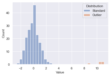
To test out the outlier detection model, a fictitious dataset from two samples was generated. Drawing 200 points at random from one distribution and 5 points at random from a separate shifted distribution gives us the below starting point. You’ll see the 200 initial points in blue and our outliers in orange. We know which is which since this was generated data, but on an unknown dataset the goal is to essentially spot the outliers without having that inside knowledge. Let’s see how well some out of the box scikit-learn algorithms can do.
Initial Dataset
Isolation Forest
One method of detecting outliers is using an Isolation Forest model from scikit-learn. This allows us to build a model that is similar to a random forest, but designed to detect outliers.
The pandas dataframe starting point after data generation is as follows — one column for the numerical values and a second ground truth that we can use for accuracy scoring:
Initial Dataframe — First 5 Rows
Fit Model
The first step is to fit our model, note the fit method just takes in X as this is an unsupervised machine learning model.
Predict Outliers
Using the predict method, we can predict whether a value is an outlier or not (1 is not an outlier, closer to -1 is an outlier)
Review Results
To review the results, we’ll both plot and calculate accuracy. Plotting our new prediction column on the original dataset yields the following. We can see that the outliers were picked up properly; however, some of the tails of our standard distribution were as well. We could further modify a contamination parameter to tune this to our dataset, but this is a great out of the box pass.
Accuracy, precision, and recall can also be simply calculated in this example. The model was 90% accurate as some of the data points from the initial dataset were incorrectly flagged as outliers.
Output: Accuracy 90%, Precision 20%, Recall 100%
Explain Rules
We can use decision tree classifiers to explain some of what is going on here.
|--- Value <= 1.57
|   |--- Value <= -1.50
|   |   |--- class: Outlier
|   |--- Value >  -1.50
|   |   |--- class: Standard
|--- Value >  1.57
|   |--- class: Outlier
The basic rules are keying off -1.5 and 1.57 as the range to determine “normal” and everything else is an outlier.
Elliptic Envelope
Isolation forests are not the only method for detecting outliers. Another that is suited for Gaussian distributed data is an Elliptic Envelope.
The code is essentially the same, we are just swapping out the model being used. Since our data was pulled from a random sample, this resulted in a slightly better fit.
Output: Accuracy 92%, Precision 24%, Recall 100%
Different outlier detection models can be run on our data to automatically detect outliers. This can be a first step taken to analyze potential data issues that may negatively affect our modeling efforts.
Understand the difference, when to use and how to code it in Python
I will start this post with a statement: normalization and standardization will not change the distribution of your data. In other words, if your variable is not normally distributed, it won’t be turn into one with the normalize method.
normalize() or StandardScaler() from sklearn won’t change the shape of your data.
Standardization
Standardization can be done using sklearn.preprocessing.StandardScaler module. What it does to your variable is centering the data to a mean of 0 and standard deviation of 1.
Doing that is important to put your data in the same scale. Sometimes you’re working with many variables of different scales. For example, let’s say you’re working on a linear regression project that has variables like years of study and salary.
Do you agree with me that years of study will float somewhere between 1 to 30? And do you also agree that the salary variable will be within the tens of thousands range?
Well, that’s a big difference between variables. That said, once the linear regression algorithm will calculate the coefficients, naturally it will give a higher number to salary in opposition to years of study. But we know we don’t want the model to make that differentiation, so we can standardize the data to put them in the same scale.
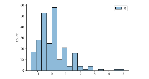
import pandas as pd
import seaborn as sns
from sklearn.preprocessing import StandardScaler, normalize
import scipy.stats as scs# Pull a dataset
df = sns.load_dataset('tips')# Histogram of tip variable
sns.histoplot(data=df, x='tip');
Histogram of the ‘tip’ variable. Image by the author.
Ok. Applying standardization.
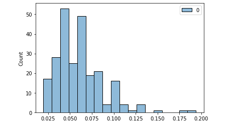
# standardizing
scaler = StandardScaler()
scaled = scaler.fit_transform(df[['tip']])# Mean and Std of standardized data
print(f'Mean: {scaled.mean().round()} | Std: {scaled.std().round()}')[OUT]: Mean: 0.0 | Std: 1.0# Histplot
sns.histplot(scaled);
Standardized ‘tip’. Image by the author.
The shape is the same. It wasn’t normal before. It’s not normal now. And we can take a Shapiro test for normal distributions before and after to confirm. The p-Value is the second number in the parenthesis (statistic test number, p-Value) and if smaller than 0.05, it means not normal distribution.
# Normal test original data
scs.shapiro(df.tip)[OUT]: (0.897811233997345, 8.20057563521992e-12)# Normal test scaled data
scs.shapiro(scaled)[OUT]: (0.8978115916252136, 8.201060490431455e-12)
Normalization
Normalization can be performed in Python with normalize() from sklearn and it won’t change the shape of your data as well. It brings the data to the same scale as well, but the main difference here is that it will present numbers between 0 and 1 (but it won’t center the data on mean 0 and std =1).
One of the most common ways to normalize is the Min Max normalization, that basically makes the maximum value equals 1 and the minimum equals 0. Everything in between will be a percentage of that, or a number between 0 and 1. However, in this example we’re using the normalize function from sklearn.
# normalize
normalized = normalize(df[['tip']], axis=0)# Normalized, but NOT Normal distribution. p-Value < 0.05
scs.shapiro(normalized)[OUT]: (0.897811233997345, 8.20057563521992e-12)
Tip variable normalized: same shape. Image by the author.
Again, our shape remains the same. The data is still not normally distributed.
Then why to perform those operations?
Standardization and Normalization are important to put all of the features in the same scale.
Algorithms like linear regression are called deterministic and what they do is to find the best numbers to solve a mathematical equation, better said, a linear equation if we’re talking about linear regression.
So the model will test many values to put as each variable’s coefficients. The numbers will be proportional to the magnitude of the variables. That said, we can understand that variables floating on the tens of thousands will have higher coefficients than those in the units range. The importance given to each will follow.
Including very large and very small numbers in a regression can lead to computational problems. When you normalize or standardize, you mitigate the problem.
Changing the Shape of the Data
There is a transformation that can change the shape of your data and make it to approximate of a normal distribution. That is the logarithmic transformation.
# Log transform and Normality
scs.shapiro(df.tip.apply(np.log))[OUT]: (0.9888471961021423, 0.05621703341603279)
p-Value > 0.05 : Data is normal# Histogram after Log transformation
sns.histplot(df.tip.apply(np.log) );
Variable ‘tip’ log transformed. Now it is a normal distribution. Image by the author.
The log transformation will remove the skewness of a dataset because it puts everything in perspective. The variances will be proportional rather than absolute, thus the shape changes and resembles a normal distribution.
A nice description I saw about this is that log transformation is like looking at a map with a scale legend where 1 cm = 1 km. We put the whole mapped space on the perspective of centimeters. We normalized the data.
When to Use Each
As far as I researched, there is no consensus whether it’s better to use Normalization or Standardization. I guess each dataset will react differently to the transformations. It is a matter of testing and comparing, given the computational power these days.
Regarding the log transformation, well, if your data is not originally normally distributed, it won’t be a log transformation that will make it that way. You can transform it, but you must reverse it later to get the real number as prediction result, for example.
The Ordinary Least Squares (OLS) regression method — calculates the linear equation that best fits to the data considering that the sum of the squares of the errors is minimum — is a math expression that predicts y based on a constant (intercept value) plus a coefficient multiplying X plus an error component (y = a + bx + e). The OLS method operates better when those errors are normally distributed, and the analyzing the residuals (predicted – actual value) are the best proxy for that.
When the residuals don’t follow a normal distribution, it is recommended that we transform the independent variable (target) to a normal distribution using a log transformation (or another Box-Cox power transformation). If that is not enough, then you can try transforming the dependent variables as well, aiming for a better fit of the model.
Thus, log transformation is recommended if you’re working with a linear model and needs to improve the linear relationship between two variables. Sometimes the relationship between variables can be exponential and log is the inverse operation of the exponential power, thus a curve becomes a line after transformation.
An exponential relationship that became a line after a log transformation. Image by the author.
Before You Go
I am no statistician or mathematician. I always make that clear and I also encourage statisticians to help me to explain this content to a broader public, the easiest way possible.
It is not easy to explain such a dense content in simple words.
An attempt to explain covariance and correlation in the simplest form.
(image by author)
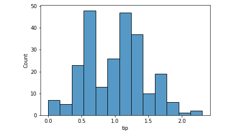
Analyzing and visualizing variables one at a time is not enough. To make various conclusions and analyses when performing exploratory data analysis, we need to understand how the variables in a dataset interact with respect to each other. There are numerous ways to analyze this relationship visually, one of the most common methods is the use of popular scatterplots. But scatterplots come with certain limitations which we will see in the later sections. Quantitatively, covariance and correlations are used to define the relationship between variables.
Scatterplots
A scatterplot is one of the most common visual forms when it comes to comprehending the relationship between variables at a glance. In the simplest form, this is nothing but a plot of Variable A against Variable B: either one being plotted on the x-axis and the remaining one on the y-axis
%matplotlib inline
import matplotlib.pyplot as plt
plt.style.use('seaborn-whitegrid')
import numpy as npdf = pd.read_csv('weight-height.csv')
df.head()plt.plot(df.Height, df.Weight,'o',markersize=2, color='brown')
plt.xlabel('Height')
plt.ylabel('Weight')
Image1: Scatterplot Height vs Weight: Positive Relationship
In the above graph, it’s easy to see that there seems to be a positive relationship between the two variables i.e. as one increases the other increases as well. A scatterplot with a negative relationship i.e. as one variable increases the other reduces may take the form of Image 2.
#Just for demonstration purposes I have taken 'a' and 'b'
import numpy as np
import random
import matplotlib.pyplot as plt
a = np.random.rand(100)*70
b = 100-a
plt.plot(a, b,'o',markersize=2, color='brown')
plt.xlabel('a')
plt.ylabel('b')
Image 2: Scatterplot a Vs b: Negative Relationship
A scatterplot with no apparent relationship between the two variables would take the form of Image 3:
import numpy as np
import random
import matplotlib.pyplot as plt
a = np.random.rand(1000)*70
b = np.random.rand(1000)*100
plt.plot(a, b,'o',markersize=2, color='brown')
plt.xlabel('a')
plt.ylabel('b')
Image 3: Scatterplot a Vs b: No apparent relationship
In general, scatterplots are best for analyzing two continuous variables. Visualizing two discrete variables using a scatterplot may cause the data points to overlap. Let’s see how a scatterplot would look like in the case of discrete variables.
x = [1,1,1,1,2,2,2,2,3,3,3,3]
y = [10,15,15,15,16,16,20,20,20,25,25,25]plt.plot(x,y,'o',markersize=5, color='brown')
plt.xlabel('X')
plt.ylabel('Y')
Image 4: Scatterplot X vs Y: Discrete Variables
In the above image, not all points are visible. To overcome this, we add random noise to the data called “Jitter”. The process is naturally called jittering to allow for a somewhat clear visualization of those overlapped points.
As seen in Image 5, more data points are now visible. However, jitter should be used only for visualization purposes and should be avoided for analysis purposes.
There can be an overlap of data in the case of continuous variables as well, where overlapping points can hide in the dense part of the data and outliers may be given disproportionate emphasis as seen in Image 1. This is called Saturation.
Scatterplot comes with its own disadvantages as it doesn’t provide quantitative measurement about the relationship, and simply shows the expression of quantitative change. We also can’t use scatterplots to display the relationship between more than two variables. Covariance and Correlation solve both these problems.
Covariance
Covariance measures how variables vary together. A positive covariance means that the variables vary together in the same direction, a negative covariance means they vary in the opposite direction and 0 covariance means that the variables don’t vary together or they are independent of each other. In other words, if there are two variables X & Y, positive covariance means a larger value of X implies a larger value of Y and negative covariance means a larger value of X implies a smaller value of Y.
Mathematically, Cov(x,y) is given by the following formula, where dxi = xi-xmean and dyi = yi -ymean. Note that the following is the formula for the covariance of a population, when calculating covariance of a sample 1/n is replaced by 1/(n-1). Why is it so, is beyond the scope of this article.
Let’s understand this with an example:
Consider,
x = [34,56,78,23]
y = [20,45,91,16]
=> xmean = 47.75
=> ymean = 43
=> Sum of (dxi*dyi) = (34–47.75)*(20–43) + (56–47.75)*(45–43) + (78–47.75)*(91–43) + (23–47.75)*(16–43) = 2453.
=> Cov(x,y) = 2453/4 = 613.25
In the above example, we can clearly see that as x increases, y increases too and hence we get a positive covariance. Now, let’s consider that x and y have units. x is height in ‘cm’ and y is weight in ‘lbs’. The unit for covariance would then be cm-lbs. Whatever that means!
Covariance can practically take any number which can be overcome using correlation which is in the range of -1 to 1. So covariance doesn’t exactly tell how strong the relationship is but simply the direction of the relationship. For these reasons, it’s also difficult to interpret covariance. To overcome some of these disadvantages we use Correlation.
Correlation
Correlation again provides quantitive information regarding the relationship between variables. Measuring correlation can be challenging if the variables have different units or if the data distributions of the variables are different from each other. Two methods of calculating correlation can help with these issues: 1) Pearson Correlation 2) Spearman Rank Correlation.
Both these methods of calculating correlation involve transforming the data in the variables being compared to some standard comparable format. Let’s see what transformations are done in both these methods.
Pearson Correlation
Pearson correlation involves transforming each of the values in the variables to a standard score or Z score i.e. finding the number of standard deviations away from each of the values is from the mean and calculating the sum of the corresponding products of the standard scores.
Z score = (Xi-Xmean)/Sigma, where sigma implies standard deviation
Suppose we have 2 variables 'x' and 'y'
Z score of x i.e. Zx = (x-xmu)/Sx
Where xmu is the mean, Sx is standard deviation
Translating this info to our understanding of Pearson Correlation  (p):
=> pi = Zxi*Zyi
=> pi = ((xi-xmean)*(yi-ymean))/Sx*Sy
=> p = mean of pi values
=> p = (sum of all values of pi)/n
=> p = (summation (xi-xmean)*(yi-ymean))/Sx*Sy*n
As seen above: (summation (xi-xmean)*(yi-ymean))/n is actually Cov(x,y).
So we can rewrite Pearson correlation (p) as Cov(x,y)/Sx*Sy
NOTE: Here, pi is not the same as mathematical constant Pi (22/7)
Pearson correlation ‘p’ will always be in the range of -1 to 1. A positive value of ‘p’ means as ‘x’ increases ‘y’ increases too, negative means as ‘x’ increases ‘y’ decreases and 0 means there is no apparent linear relationship between ‘x’ and ‘y’. Note that a zero Pearson correlation doesn’t imply ‘no relationship’, it simply means that there isn’t a linear relationship between ‘x’ and ‘y’.
Pearson correlation ‘p’ = 1 means a perfect positive relationship, however, a value of 0.5 or 0.4 implies there is a positive relationship but the relationship may not be as strong. The magnitude or the value of Pearson correlation determines the strength of the relationship.
But again, Pearson correlation does come with certain disadvantages. This method of correlation doesn’t work well if there are outliers in the data, as it can get affected by the outliers. Pearson Correlation works well if the changes in variable x with respect to variable y is linear i.e. when the change happens at a constant rate and when x and y are both somewhat normally distributed or when the data is on an interval scale.
These disadvantages of Pearson correlation can be overcome using the Spearman Rank Correlation.
Spearman Rank Correlation
In the Spearman method, we transform each of the values in both variables to its corresponding rank in the given variable and then calculate the Pearson correlation of the ranks.
Consider x = [23,98,56,1,0,56,1999,12],
Corresponding Rankx = [4,7,5,2,1,6,8,3]
Similarly, for y = [5,92,88,45,2,54,90,1],
Corresponding Ranky = [3,8,6,4,2,5,7,1]
Looking at Rankx and Ranky, the advantage of this method seems to be apparent. Both Rankx and Ranky do not contain any outliers, even if the actual data has any outliers, the outlier will be converted into a rank that is nothing but the relative positive of the number in the dataset. Hence, this method is robust against outliers. This method also solves the problem of data distributions. The data distributions of the ranks will always be uniform. We then calculate the Pearson correlation of Rankx and Ranky using the formula seen in the Pearson correlation section.
But Spearman Rank method works well:
When x changes as y does, but not necessarily at a constant rate i.e. when there is a non-linear relationship between x and y
When x and y have different data distributions or non-normal distribution
Train, visualize, evaluate, interpret, and deploy models with minimal code
When we approach supervised machine learning problems, it can be tempting to just see how a random forest or gradient boosting model performs and stop experimenting if we are satisfied with the results. What if you could compare many different models with just one line of code? What if you could reduce each step of the data science process from feature engineering to model deployment to just a few lines of code?
This is exactly where PyCaret comes into play. PyCaret is a high-level, low-code Python library that makes it easy to compare, train, evaluate, tune, and deploy machine learning models with only a few lines of code. At its core, PyCaret is basically just a large wrapper over many data science libraries such as Scikit-learn, Yellowbrick, SHAP, Optuna, and Spacy. Yes, you could use these libraries for the same tasks, but if you don’t want to write a lot of code, PyCaret could save you a lot of time.
In this article, I will demonstrate how you can use PyCaret to quickly and easily build a machine learning project and prepare the final model for deployment.
Installing PyCaret
PyCaret is a large library with a lot of dependencies. I would recommend creating a virtual environment specifically for PyCaret using Conda so that the installation does not impact any of your existing libraries. To create and activate a virtual environment in Conda, run the following commands:
Now, after launching a Jupyter Notebook in your browser, you should be able to see the option to change your environment to the one you just created.
Changing the Conda virtual environment in Jupyter.
Import Libraries
You can find the entire code for this article in this GitHub repository. In the code below, I simply imported Numpy and Pandas for handling the data for this demonstration.
import numpy as np
import pandas as pd
Read the Data
For this example, I used the California Housing Prices Dataset available on Kaggle. In the code below, I read this dataset into a dataframe and displayed the first ten rows of the dataframe.
The output above gives us an idea of what the data looks like. The data contains mostly numerical features with one categorical feature for the proximity of each house to the ocean. The target column that we are trying to predict is the median_house_value column. The entire dataset contains a total of 20,640 observations.
Initialize Experiment
Now that we have the data, we can initialize a PyCaret experiment, which will preprocess the data and enable logging for all of the models that we will train on this dataset.
As demonstrated in the GIF below, running the code above preprocesses the data and then produces a dataframe with the options for the experiment.
Pycaret setup function output.
Compare Baseline Models
We can compare different baseline models at once to find the model that achieves the best K-fold cross-validation performance with the compare_models function as shown in the code below. I have excluded XGBoost in the example below for demonstration purposes.
The function produces a data frame with the performance statistics for each model and highlights the metrics for the best performing model, which in this case was the CatBoost regressor.
Creating a Model
We can also train a model in just a single line of code with PyCaret. The create_model function simply requires a string corresponding to the type of model that you want to train. You can find a complete list of acceptable strings and the corresponding regression models on the PyCaret documentation page for this function.
catboost = create_model('catboost')
The create_model function produces the dataframe above with cross-validation metrics for the trained CatBoost model.
Hyperparameter Tuning
Now that we have a trained model, we can optimize it even further with hyperparameter tuning. With just one line of code, we can tune the hyperparameters of this model as demonstrated below.
Results of hyperparameter tuning with 10-fold cross-validation.
The most important results, in this case, the average metrics, are highlighted in yellow.
Visualizing the Model’s Performance
There are many plots that we can create with PyCaret to visualize a model’s performance. PyCaret uses another high-level library called Yellowbrick for building these visualizations.
Residual Plot
The plot_model function will produce a residual plot by default for a regression model as demonstrated below.
plot_model(tuned_catboost)
Residual plot for the tuned CatBoost model.
Prediction Error
We can also visualize the predicted values against the actual target values by creating a prediction error plot.
plot_model(tuned_catboost, plot = 'error')
Prediction error plot for the tuned CatBoost regressor.
The plot above is particularly useful because it gives us a visual representation of the R² coefficient for the CatBoost model. In a perfect scenario (R² = 1), where the predicted values exactly matched the actual target values, this plot would simply contain points along the dashed identity line.
Feature Importances
We can also visualize the feature importances for a model as shown below.
plot_model(tuned_catboost, plot = 'feature')
Feature importance plot for the CatBoost regressor.
Based on the plot above, we can see that the median_income feature is the most important feature when predicting the price of a house. Since this feature corresponds to the median income in the area in which a house was built, this evaluation makes perfect sense. Houses built in higher-income areas are likely more expensive than those in lower-income areas.
Evaluating the Model Using All Plots
We can also create multiple plots for evaluating a model with the evaluate_model function.
evaluate_model(tuned_catboost)
The interface created using the evaluate_model function.
With just one line of code, we can create a SHAP beeswarm plot for the model.
interpret_model(tuned_catboost)
SHAP plot produced by calling the interpret_model function.
Based on the plot above, we can see that the median_income field has the greatest impact on the predicted house value.
AutoML
PyCaret also has a function for running automated machine learning (AutoML). We can specify the loss function or metric that we want to optimize and then just let the library take over as demonstrated below.
automl_model = automl(optimize = 'MAE')
In this example, the AutoML model also happens to be a CatBoost regressor, which we can confirm by printing out the model.
print(automl_model)
Running the print statement above produces the following output:
<catboost.core.CatBoostRegressor at 0x7f9f05f4aad0>
Generating Predictions
The predict_model function allows us to generate predictions by either using data from the experiment or new unseen data.
The predict_model function above produces predictions for the holdout datasets used for validating the model during cross-validation. The code also gives us a dataframe with performance statistics for the predictions generated by the AutoML model.
Predictions generated by the AutoML model.
In the output above, the Label column represents the predictions generated by the AutoML model. We can also produce predictions on the entire dataset as demonstrated in the code below.
PyCaret also allows us to save trained models with the save_model function. This function saves the transformation pipeline for the model to a pickle file.
As we can see from the output above, PyCaret not only saved the trained model at the end of the pipeline but also the feature engineering and data preprocessing steps at the beginning of the pipeline. Now, we have a production-ready machine learning pipeline in a single file and we don’t have to worry about putting the individual parts of the pipeline together.
Model Deployment
Now that we have a model pipeline that is ready for production, we can also deploy the model to a cloud platform such as AWS with the deploy_model function. Before running this function, you must run the following command to configure your AWS command-line interface if you plan on deploying the model to an S3 bucket:
aws configure
Running the code above will trigger a series of prompts for information like your AWS Secret Access Key that you will need to provide. Once this process is complete, you are ready to deploy the model with the deploy_model function.
In the code above, I deployed the AutoML model to an S3 bucket named pycaret-ca-housing-model in AWS. From here, you can write an AWS Lambda function that pulls the model from S3 and runs in the cloud. PyCaret also allows you to load the model from S3 using the load_model function.
MLflow UI
Another nice feature of PyCaret is that it can log and track your machine learning experiments with a machine learning lifecycle tool called MLfLow. Running the command below will launch the MLflow user interface in your browser from localhost.
!mlflow ui
MLFlow dashboard.
In the dashboard above, we can see that MLflow keeps track of the runs for different models for your PyCaret experiments. You can view the performance metrics as well as the running times for each run in your experiment.
Pros and Cons of Using PyCaret
If you’ve read this far, you now have a basic understanding of how to use PyCaret. While PyCaret is a great tool, it comes with its own pros and cons that you should be aware of if you plan to use it for your data science projects.
Pros
Low-code library.
Great for simple, standard tasks and general-purpose machine learning.
Provides support for regression, classification, natural language processing, clustering, anomaly detection, and association rule mining.
Makes it easy to create and save complex transformation pipelines for models.
Makes it easy to visualize the performance of your model.
Cons
As of now, PyCaret is not ideal for text classification because the NLP utilities are limited to topic modeling algorithms.
PyCaret is not ideal for deep learning and doesn’t use Keras or PyTorch models.
You can’t perform more complex machine learning tasks such as image classification and text generation with PyCaret (at least with version 2.2.0).
By using PyCaret, you are sacrificing a certain degree of control for simple and high-level code.
Summary
In this article, I demonstrated how you can use PyCaret to complete all of the steps in a machine learning project ranging from data preprocessing to model deployment. While PyCaret is a useful tool, you should be aware of its pros and cons if you plan to use it for your data science projects. PyCaret is great for general-purpose machine learning with tabular data but as of version 2.2.0, it is not designed for more complex natural language processing, deep learning, and computer vision tasks. But it is still a time-saving tool and who knows, maybe the developers will add support for more complex tasks in the future?
In this article, we will present Shapash, an open-source python library that helps Data Scientists to make their Machine Learning models more transparent and understandable by all!
Shapash by MAIF is a Python Toolkit that facilitates the understanding of Machine Learning models to data scientists. It makes it easier to share and discuss the model interpretability with non-data specialists: business analysts, managers, end-users…
Concretely, Shapash provides easy-to-read visualizations and a web app. Shapash displays results with appropriate wording (preprocessing inverse/postprocessing). Shapashis useful in an operational context as it enables data scientists to use explicability from exploration to production: You can easily deploy local explainability in production to complete each of your forecasts/recommendations with a summary of the local explainability.
In this post, we will present the main features of Shapash and how it operates. We will illustrate the implementation of the library on a concrete use case.
Elements of context:
Interpretability and explicability of models are hot topics. There are many articles, publications, and open-source contributions about it. All these contributions do not deal with the same issues and challenges.
Most data scientists use these techniques for many reasons: to better understand their models, to check that they are consistent and unbiased, as well as for debugging.
However, there is more to it:
Intelligibility matters for pedagogic purposes. Intelligible Machine Learning models can be debated with people that are not data specialists: business analysts, final users…
Concretely, there are two steps in our Data Science projects that involve non-specialists:
Exploratory step & Model fitting:
At this step, data scientists and business analysts discuss what is at stake and to define the essential data they will integrate into the projects. It requires to well understand the subject and the main drivers of the problem we are modeling.
To do this, data scientists study global explicability, features importance, and which role the model’s top features play. They can also locally look at some individuals, especially outliers. A Web App is interesting at this phase because they need to look at visualizations and graphics. Discussing these results with business analysts is interesting to challenge the approach and validate the model.
Deploying the model in a production environment
That’s it! The model is validated, deployed, and gives predictions to the end-users. Local explicability can bring them a lot of value, only if there is a way to provide them with a good, useful, and understandable summary. It will be valuable to them for two reasons:
Transparency brings trust: He will trust models if he understands them.
Human stays in control: No model is 100% reliable. When they can understand the algorithm’s outputs, users can overturn the algorithm suggestions if they think they rest on incorrect data.
Shapash has been developed to help data scientists to meet these needs.
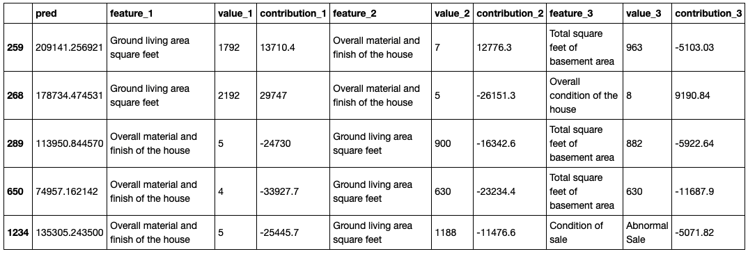
Shapash key features:
Easy-to-read visualizations, for everyone.
A web app: To understand how a model works, you have to look at multiple graphs, features importance and global contribution of a feature to a model. A web app is a useful tool for this.
Several methods to show results with appropriate wording (preprocessing inverse, post-processing). You can easily add your data dictionaries, category-encoders object or sklearn ColumnTransformer for more explicit outputs.
Functions to easily save Pickle files and to export results in tables.
Explainability summary: the summary is configurable to fit with your need and to focus on what matters for local explicability.
Ability to easily deploy in a production environment and to complete every prediction/recommendation with a local explicability summary for each operational apps (Batch or API)
Shapash is open to several ways of proceeding: It can be used to easily access to results or to work on, better wording. Very few arguments are required to display results. But the more you work with cleaning and documenting the dataset, the clearer the results will be for the end-user.
Shapash works for Regression, Binary Classification or Multiclass problems. It is compatible with many models: Catboost, Xgboost, LightGBM, Sklearn Ensemble, Linear models, SVM.
Shapash is based on local contributions calculated with Shap (shapley values), Lime, or any technique which allows computing summable local contributions.
Installation
You can install the package through pip:
$pip install shapash
Shapash Demonstration
Let’s useShapash on a concrete dataset. In the rest of this article, we will show you how Shapash can explore models.
We will use the famous “House Prices” dataset from Kaggle to fit a regressor … and predict house prices! Let’s start by loading the Dataset:
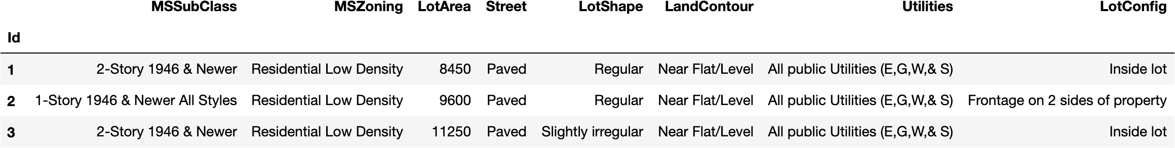
import pandas as pd
from shapash.data.data_loader import data_loading
house_df, house_dict = data_loading('house_prices')
y_df=house_df['SalePrice'].to_frame()
X_df=house_df[house_df.columns.difference(['SalePrice'])]house_df.head(3)
Encode the categorical features:
from category_encoders import OrdinalEncoder

categorical_features = [col for col in X_df.columns if X_df[col].dtype == 'object']
encoder = OrdinalEncoder(cols=categorical_features).fit(X_df)
X_df=encoder.transform(X_df)
Train, test split and model fitting.
from sklearn.model_selection import train_test_split from sklearn.ensemble import RandomForestRegressor
The compile method permits to use of another optional parameter: postprocess. It gives the possibility to apply new functions to specify to have better wording (regex, mapping dict, …).
Now, we can display results and understand how the regression model works!
Step 4 — Launching the Web App
app = xpl.run_app()
The web app link appears in Jupyter output (access the demo here).
There are four parts in this Web App:
Each one interacts to help to explore the model easily.
Features Importance: you can click on each feature to update the contribution plot below.
Contribution plot: How does a feature influence the prediction? Display violin or scatter plot of each local contribution of the feature.
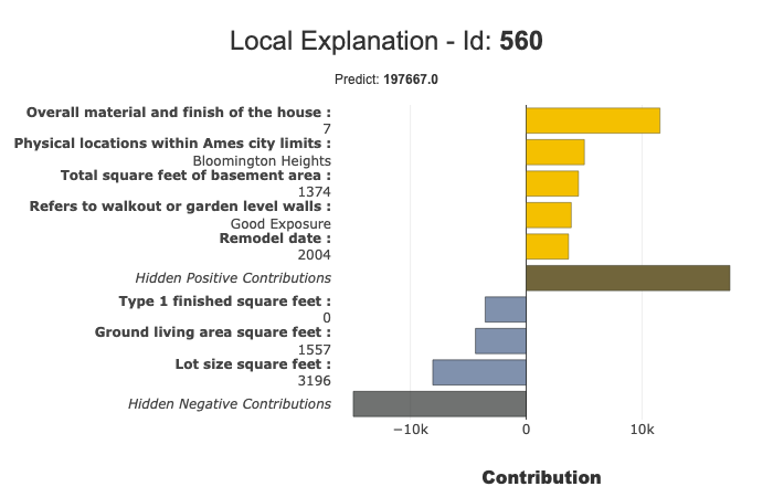
Local Plot:
Local explanation: which features contribute the most to the predicted value.
You can use several buttons/sliders/lists to configure the summary of this local explainability. We will describe below with the filter method the different parameters you can work your summary with.
This web app is a useful tool to discuss with business analysts the best way to summarize the explainability to meet operational needs.
Selection Table: It allows the Web App user to select:
A subset to focus the exploration on this subset
A single row to display the associated local explanation
How to use the Data table to select a subset? At the top of the table, just below the name of the column that you want to use to filter, specify:
=Value, >Value, <Value
If you want to select every row containing a specific word, just type that word without “=”
There are a few options available on this web app (top right button). The most important one is probably the size of the sample (default: 1000). To avoid latency, the web app relies on a sample to display the results. Use this option to modify this sample size.
To kill the app:
app.kill()
Step 5 — The plots
All the plots are available in jupyter notebooks, the paragraph below describes the key points of each plot.
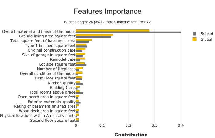
Feature Importance
This parameter allows comparing features importance of a subset. It is useful to detect specific behavior in a subset.
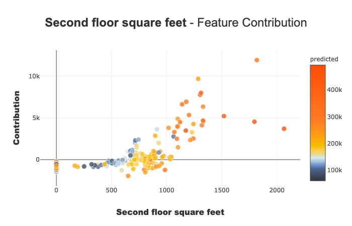
Contribution plots are used to answer questions like:
How a feature impacts my prediction? Does it contribute positively? Is the feature increasingly contributing? decreasingly? Are there any threshold effects? For a categorical variable, how does each modality contributes? …This plot completes the importance of the features for the interpretability, the global intelligibility of the model to better understand the influence of a feature on a model.
There are several parameters on this plot. Note that the plot displayed adapts depending on whether you are interested in a categorical or continuous variable (Violin or Scatter) and depending on the type of use case you address (regression, classification)
xpl.plot.contribution_plot("OverallQual")
Contribution plot applied to a continuous feature.
You can use local plots for local explainability of models.
The filter () and local_plot () methods allow you to test and choose the best way to summarize the signal that the model has picked up. You can use it during the exploratory phase. You can then deploy this summary in a production environment for the end-user to understand in a few seconds what are the most influential criteria for each recommendation.
We will publish a second article to explain how to deploy local explainability in production.
Combine the filter and local_plot method
Use the filter method to specify how to summarize local explainability. You have four parameters to configure your summary:
max_contrib: maximum number of criteria to display
threshold: minimum value of the contribution (in absolute value) necessary to display a criterion
positive: display only positive contribution? Negative? (default None)
features_to_hide: list of features you don’t want to display
After defining these parameters, we can display the results with the local_plot() method, or export them with to_pandas().
With the compare_plot() method, the SmartExplainer object makes it possible to understand why two or more individuals do not have the same predicted values. The most decisive criterion appears at the top of the plot.
Pandas is a highly popular data analysis and manipulation library. It provides numerous functions to perform efficient data analysis. Furthermore, its syntax is simple and easy-to-understand.
In this article, we focus on a particular function of Pandas, the groupby. It is used to group the data points (i.e. rows) based on the categories or distinct values in a column. We can then calculate a statistic or apply a function on a numerical column with regards to the grouped categories.
The process will be clear as we go through the examples. Let’s start by importing the libraries.
import numpy as np
import pandas as pd
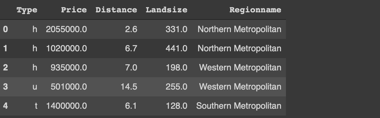
We also need a dataset for the examples. We will use a small sample from the Melbourne housing dataset available on Kaggle.
I have only read a small part of the original dataset. The usecols parameter of the read_csv function allows for reading only the given columns of the csv file. I have also filtered out the outliers with regards to the price and land size. Finally, a random sample of 1000 observations (i.e. rows) is selected using the sample function.
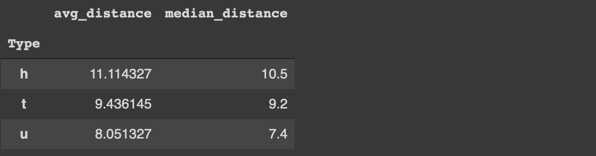
Before starting on the tips, let’s implement a simple groupby function to perform average distance for each category in the type column.
df[['Type','Distance']].groupby('Type').mean()
The houses (h) are further away from the central business district than the other two types on average.
We can now start with the tips to use the groupby function more effectively.
1. Customize the column names
The groupby function does not change or customize the column names so we do not really know what the aggregated values represent. For instance, in the previous example, it would be more informative to change the column name from “distance” to “avg_distance”.
One way to accomplish this is to use the agg function instead of the mean function.
We can always change the column name afterwards but this method is more practical.
Customizing the column names becomes more important if we aggregate multiple columns or apply different functions to one column. The agg function accepts multiple aggregations. We just need to specify the column name and the function.
For instance, we can calculate the average and median distance values for each category in the type column as below.
Lambda expression is a special form of functions in Python. In general, lambda expressions are used without a name so we do not define them with the def keyword like normal functions.
The main motivations behind the lambda expressions are simplicity and practicality. They are one-liners and usually only used at once.
The agg function accepts lambda expressions. Thus, we can perform more complex calculations and transformations along with the groupby function.
For instance, we can calculate the average price for each type and convert it to millions with one lambda expression.
If we want to perform analysis on this dataframe later on, it is not practical to have the type and region name columns as index. We can always use the reset_index function but there is a more optimal way.
If the as_index parameter of the groupby function is set to false, the grouped columns are represented as columns instead of index.
The groupby function ignores the missing values by default. Let’s first update some of the values in the type column as missing.
df.iloc[100:150, 0] = np.nan
The iloc function selects row-column combinations by using indices. The code above updates the rows between 100 and 150 of the first column (0 index) as missing value (np.nan).
If we try to calculate the average distance for each category in the type column, we will not get any information about the missing values.
df[['Type','Distance']].groupby('Type').mean()
In some case, we also need to get an overview of the missing values. It may affect how we aim to handle the them. The dropna parameter of the groupby function is used to also calculate the aggregations on the missing values.
The groupby functions is one of the most frequently used functions in the exploratory data analysis process. It provides valuable insight into the relationships between variables.
It is important to use the groupby function efficiently to boost the data analysis process with Pandas. The 4 tips we have covered in this article will help you make the most of the groupby function.
In this post, we are going to introduce you to the Support Vector Machine (SVM) machine learning algorithm. We will follow a similar process to our recent post Naive Bayes for Dummies; A Simple Explanation by keeping it short and not overly-technical. The aim is to give those of you who are new to machine learning a basic understanding of the key concepts of this algorithm.
Support Vector Machines – What are they?
A Support Vector Machine (SVM) is a supervised machine learning algorithm that can be employed for both classification and regression purposes. SVMs are more commonly used in classification problems and as such, this is what we will focus on in this post.
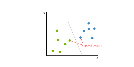
SVMs are based on the idea of finding a hyperplane that best divides a dataset into two classes, as shown in the image below.
Support Vectors
Support vectors are the data points nearest to the hyperplane, the points of a data set that, if removed, would alter the position of the dividing hyperplane. Because of this, they can be considered the critical elements of a data set.
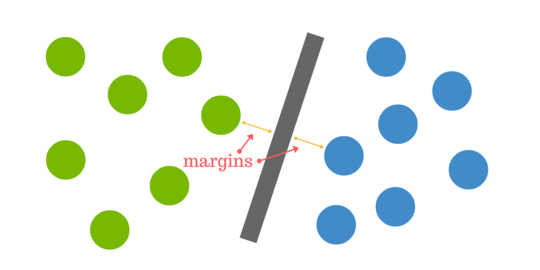
What is a hyperplane?
As a simple example, for a classification task with only two features (like the image above), you can think of a hyperplane as a line that linearly separates and classifies a set of data.
Intuitively, the further from the hyperplane our data points lie, the more confident we are that they have been correctly classified. We therefore want our data points to be as far away from the hyperplane as possible, while still being on the correct side of it.
So when new testing data is added, whatever side of the hyperplane it lands will decide the class that we assign to it.
How do we find the right hyperplane?
Or, in other words, how do we best segregate the two classes within the data?
The distance between the hyperplane and the nearest data point from either set is known as the margin. The goal is to choose a hyperplane with the greatest possible margin between the hyperplane and any point within the training set, giving a greater chance of new data being classified correctly.
But what happens when there is no clear hyperplane?
This is where it can get tricky. Data is rarely ever as clean as our simple example above. A dataset will often look more like the jumbled balls below which represent a linearly non separable dataset.
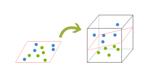
< In order to classify a dataset like the one above it’s necessary to move away from a 2d view of the data to a 3d view. Explaining this is easiest with another simplified example. Imagine that our two sets of colored balls above are sitting on a sheet and this sheet is lifted suddenly, launching the balls into the air. While the balls are up in the air, you use the sheet to separate them. This ‘lifting’ of the balls represents the mapping of data into a higher dimension. This is known as kernelling. You can read more on Kerneling here.
Because we are now in three dimensions, our hyperplane can no longer be a line. It must now be a plane as shown in the example above. The idea is that the data will continue to be mapped into higher and higher dimensions until a hyperplane can be formed to segregate it.
Pros & Cons of Support Vector Machines
Pros
Accuracy
Works well on smaller cleaner datasets
It can be more efficient because it uses a subset of training points
Cons
Isn’t suited to larger datasets as the training time with SVMs can be high
Less effective on noisier datasets with overlapping classes
SVM Uses
SVM is used for text classification tasks such as category assignment, detecting spam and sentiment analysis. It is also commonly used for image recognition challenges, performing particularly well in aspect-based recognition and color-based classification. SVM also plays a vital role in many areas of handwritten digit recognition, such as postal automation services.
There you have it, a very high level introduction to Support Vector Machines.
One of the most frustrating things that happen — more often than data scientists like to admit — after they spend hours upon hours gathering data, cleaning it, labeling it, and using it to train and develop a machine learning model is ending up with a model with low accuracy or large error range.
In machine learning, the term model accuracy refers to the measurements made to decide whether or not a certain model is the best to describe the relationship between the different problem variables. We often use training data (sample data) to train a model for new, unused data.
If our model has good accuracy, it will perform well on both the training data and the new one. Having a model with high accuracy is essential to the overall project’s success, and if you’re building it for a client, it’s important for your paycheck!
So, have can we avoid all of that and improve the accuracy of our machine learning model? There are different ways a data scientist can use to improve their model’s accuracy; in this article, we will go through 6 of such ways. Let’s jump right in…
Most ML engineers are familiar with the quote, “Garbage in, garbage out”. Your model can perform only so much when the data it is trained upon is poorly representative of the actual scenario. What do I mean by ‘representative’? It refers to how well the training data population mimics the target population; the proportions of the different classes, or the point estimates (like mean, or median), and the variability (like variance, standard deviation, or interquartile range) of the training and target populations.
Generally, the larger the data, the more likely it is to be representative of the target population to which you want to generalize. if you want to generalize the population of students in Grade 1 to 12 of a school you cannot just use 80% of Grade 8 population because the data you want to predict will be faulty because of your dataset. It is crucial to have a good understanding of the distribution of your target population in order to devise the right data collection techniques. Once you have the data, study the data (the exploratory data analysis phase) in order to determine its distribution and representativeness.
Outliers, missing values, and outright wrong or false data are some of the other considerations that you might have. Should you cap outliers at a certain value? Or remove them entirely? How about normalizing the values? Should you include data with some missing values? Or use the mean or median values instead to replace the missing values? Does the data collection method support the integrity of the data? These are some of the questions that you must evaluate before thinking about the model. Data cleaning is probably the most important step after data collection.
Method 1: Add more data samples
Data tells a story only if you have enough of it. Every data sample provides some input and perspective to your data’s overall story is trying to tell you. Perhaps the easiest and most straightforward way to improve your model’s performance and increase its accuracy is to add more data samples to the training data.
Doing so will add more details to your data and finetune your model resulting in a more accurate performance. Rember after all, the more information you give your model, the more it will learn and the more cases it will be able to identify correctly.
Method 2: Look at the problem differently
Sometimes adding more data couldn’t be the answer to your model inaccuracy problem. You’re providing your model with a good technique and the correct dataset. But you’re not getting the results you hope for; why?
Context is important in any situation, and training a machine learning model is no different. Sometimes, one point of data can’t tell a story, so you need to add more context for any algorithm we intend to apply to this data to have a good performance.
More context can always lead to a better understanding of the problem and, eventually, better performance of the model. Imagine I tell you I am selling a car, a BMW. That alone doesn’t give you much information about the car. But, if I add the color, model and distance traveled, then you’ll start to have a better picture of the car and its possible value.
Method 4: Finetune your hyperparameter
Training a machine learning model is a skill that you can only hone with practice. Yes, there are rules you can follow to train your model, but these rules don’t give you the answer your seeking, only the way to reach that answer.
However, to get the answer, you will need to do some trial and error until you reach your answer. When I first started learning the different machine learning algorithms, such as the K-means, I was lost on choosing the best number of clusters to reach the optimal results. The way to optimize the results is to tune its hyper-parameters. So, tuning the parameters of the algorithm will always lead to better accuracy.
Method 5: Train your model using cross-validation
In machine learning, cross-validation is a technique used to enhance the model training process by dividing the overall training set into smaller chunks and then use each chunk to train the model.
What if you tried all the approaches we talked about so far and your model still results in a low or average accuracy? What then?
Sometimes we choose an algorithm to implement that doesn’t really apply to the data we have, and so we don’t get the results we expect. Changing the algorithm, you’re using to implement your solution. Trying out different algorithms will lead you to uncover more details about your data and the story it’s trying to tell.
Takeaways
One of the most difficult things to learn as a new data scientist and to master as a professional one is improving your machine learning model’s accuracy. If you’re a freelance developer, own your own company, or have a role as a data scientist, having a high accuracy model can make or break your entire project.
Luckily, there are various simple yet efficient ways one can make to increase the accuracy of their model and save them much time, money, and effort that can be wasted on error mitigating if the model’s accuracy is low.
Improving the accuracy of a machine learning model is a skill that can only improve with practice. The more projects you build, the better your intuition will get about which approach you should use next time to improve your model’s accuracy. With time, your models will become more accurate and your projects more concrete.
The penalty in Logistic Regression Classifier i.e. L1 or L2 regularization
The learning rate for training a neural network.
The C and sigma hyperparameters for support vector machines.
The k in k-nearest neighbors.
The aim of this article is to explore various strategies to tune hyperparameter for Machine learning model.
Models can have many hyperparameters and finding the best combination of parameters can be treated as a search problem. Two best strategies for Hyperparameter tuning are:
GridSearchCV In GridSearchCV approach, machine learning model is evaluated for a range of hyperparameter values. This approach is called GridSearchCV, because it searches for best set of hyperparameters from a grid of hyperparameters values.
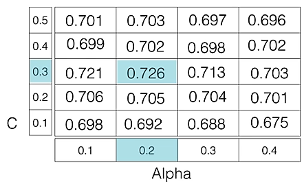
For example, if we want to set two hyperparameters C and Alpha of Logistic Regression Classifier model, with different set of values. The gridsearch technique will construct many versions of the model with all possible combinations of hyerparameters, and will return the best one.
As in the image, for C = [0.1, 0.2, 0.3, 0.4, 0.5] and Alpha = [0.1, 0.2, 0.3, 0.4]. For a combination C=0.3 and Alpha=0.2, performance score comes out to be 0.726(Highest), therefore it is selected.
Following code illustrates how to use GridSearchCV
Tuned Logistic Regression Parameters: {‘C’: 3.7275937203149381} Best score is 0.7708333333333334
Drawback : GridSearchCV will go through all the intermediate combinations of hyperparameters which makes grid search computationally very expensive.
RandomizedSearchCV RandomizedSearchCV solves the drawbacks of GridSearchCV, as it goes through only a fixed number of hyperparameter settings. It moves within the grid in random fashion to find the best set hyperparameters. This approach reduces unnecessary computation. Following code illustrates how to use RandomizedSearchCV
# Necessary imports fromscipy.stats importrandint fromsklearn.tree importDecisionTreeClassifier fromsklearn.model_selection importRandomizedSearchCV # Creating the hyperparameter grid param_dist ={"max_depth": [3, None], "max_features": randint(1, 9), "min_samples_leaf": randint(1, 9), "criterion": ["gini", "entropy"]} # Instantiating Decision Tree classifier tree =DecisionTreeClassifier() # Instantiating RandomizedSearchCV object tree_cv =RandomizedSearchCV(tree, param_dist, cv =5) tree_cv.fit(X, y) # Print the tuned parameters and score print("Tuned Decision Tree Parameters: {}".format(tree_cv.best_params_)) print("Best score is {}".format(tree_cv.best_score_))
Output:
Tuned Decision Tree Parameters: {‘min_samples_leaf’: 5, ‘max_depth’: 3, ‘max_features’: 5, ‘criterion’: ‘gini’} Best score is 0.7265625


 < In order to classify a dataset like the one above it’s necessary to move away from a 2d view of the data to a 3d view. Explaining this is easiest with another simplified example. Imagine that our two sets of colored balls above are sitting on a sheet and this sheet is lifted suddenly, launching the balls into the air. While the balls are up in the air, you use the sheet to separate them. This ‘lifting’ of the balls represents the mapping of data into a higher dimension. This is known as kernelling. You can read more on Kerneling