

Motivation
Have you ever taken 15 minutes or so just to manipulate the data and create a plot in Python? Wouldn’t it be nice if you can quickly extract insights from data by simply dragging and dropping like below?
That is when atoti comes in handy. In this article, you will learn how to quickly create a dashboard in Python and share it with others using atoti.
What is atoti?
atoti is a free Python BI analytics platform for data scientists, data analysts, and business users.
With atoti, you can quickly:
- Create different scenarios and compare them side by side
- Create and gain insights from a multi-dimensional dataset
- Share results with your coworkers and stakeholders
- Create interactive visualization on Jupyter lab without coding
and more.
To install atoti, type:
pip install atoti[jupyterlab]
Now when you open a Jupyter lab by running:
jupyter lab
You should see the atoti icon in the left panel.

Create a Cube
To learn how atoti works, let’s use it to analyze the Data scientist salary dataset on Kaggle.
Start with creating a session. The config argument is optional but is important if you want to save your dashboard or share it with others. Specifically,
user_content_storagespecifies the location where the dashboard is storedportspecifies the port number for the dashboard app. Ifportis not specified, atoti will choose a random port.
import atoti as tt

session = tt.create_session(
    config={
        "user_content_storage": "./content",
        "port": 9000,
    }
)
Create a DataFrame by reading data from a CSV
df = session.read_csv("data_cleaned_2021.csv")
df.head()
Next, create a cube:
cube = session.create_cube(df)
https://pub.towardsai.net/media/d1c64630e44c908857d84d83e8892df2
A cube is a multidimensional view of your data, making it easier to aggregate, filter, and compare. It is called a cube because each categorical column of the data can be represented as a dimension of the cube:

A cube consists of 2 components: dimensions and measures.


hierarchized_columns tosession.read_csv()df = session.read_csv(“data_cleaned_2021.csv”, hierarchized_columns=[…])
Now, let’s try to interact with this cube on the atoti dashboard.
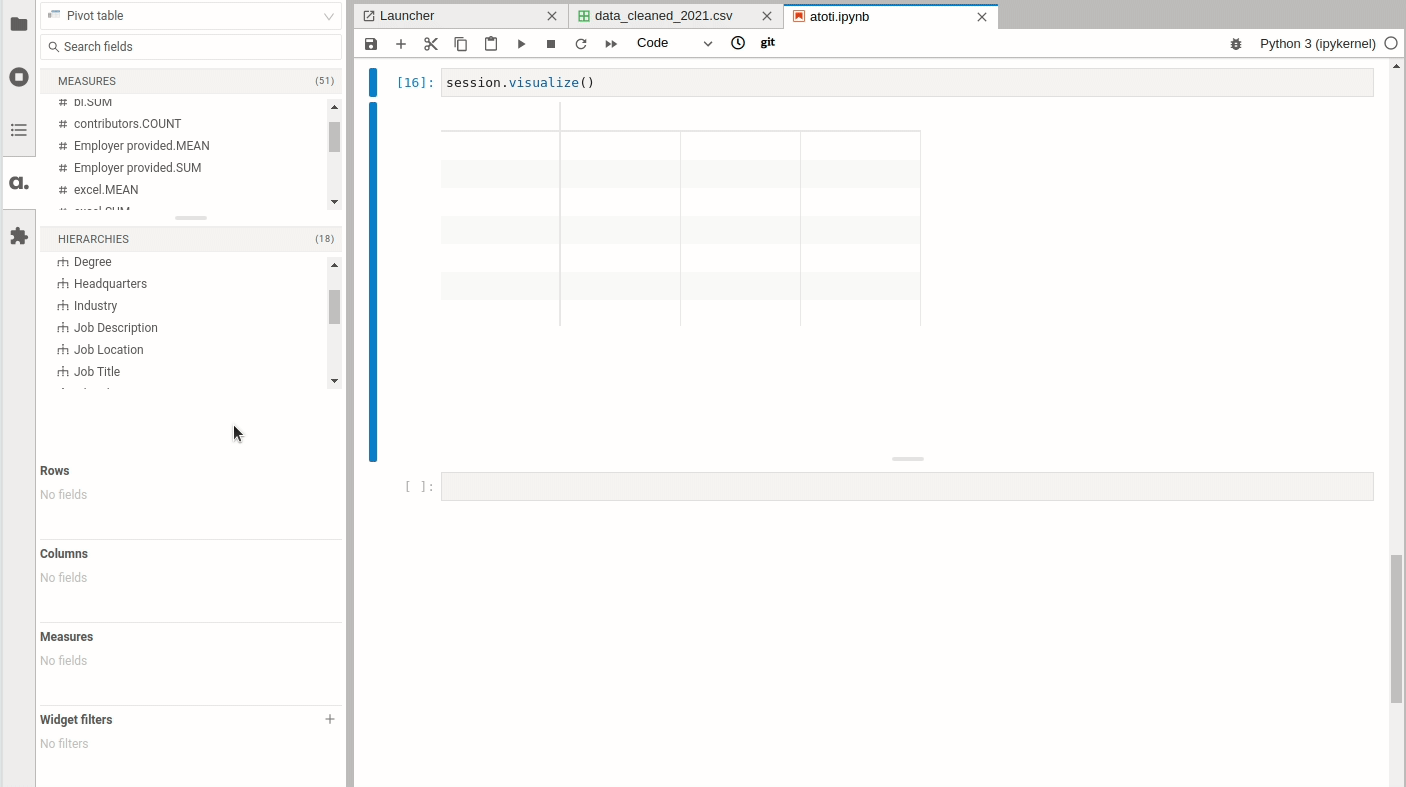
Create a Dashboard
To create a dashboard with atoti, simply type:
session.visualize()
Let’s use atoti to get some interesting insights from our data.
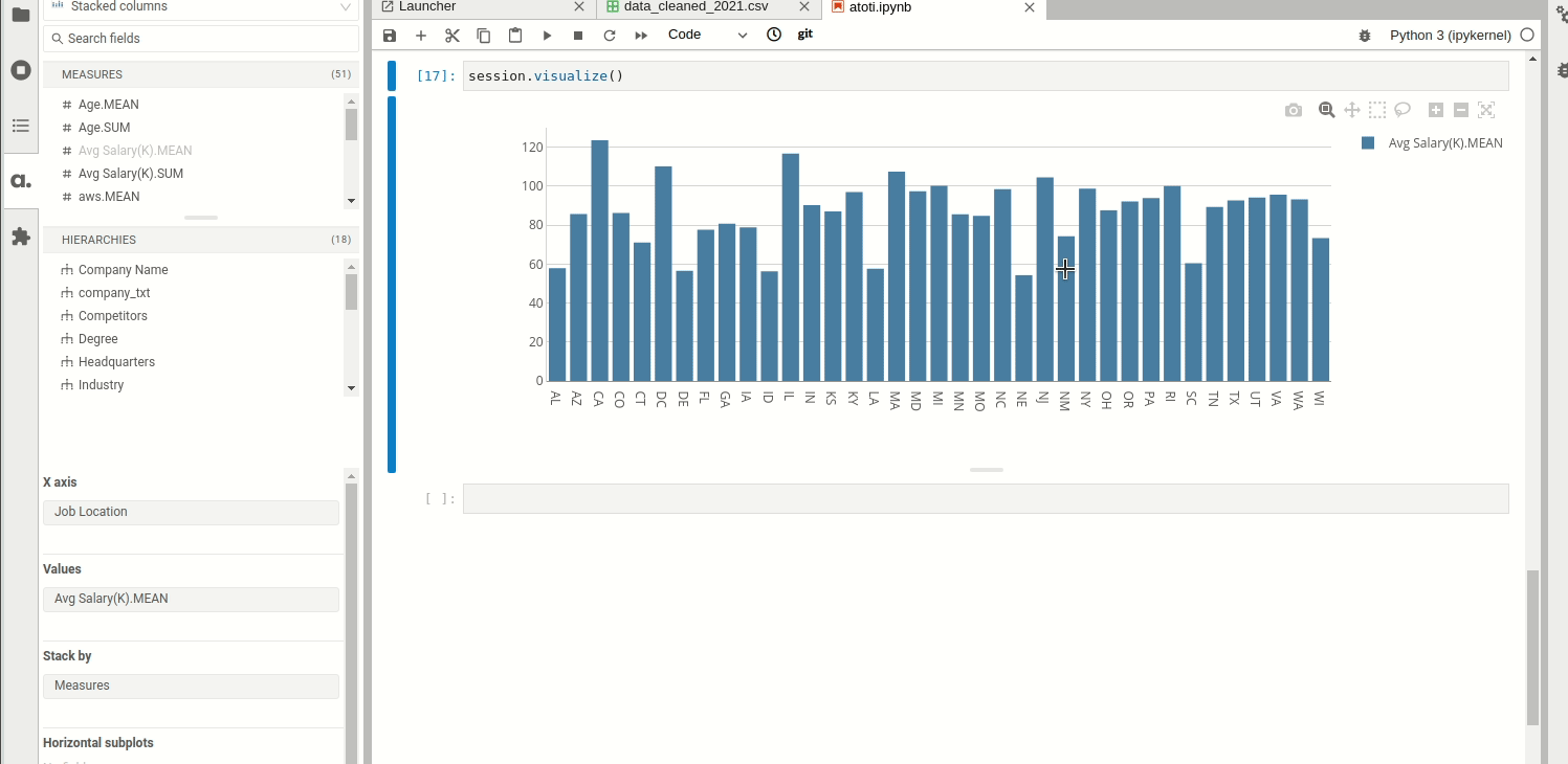
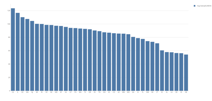
Salary by State
First of all, what is the average salary by the state? That can easily be found by clicking Job Location in the Hierarchies session and clicking Avg.Salary(K).MEAN in the Measures session.
Once the pivot table is created, you can click one of the charts on the top panel to create a chart based on the table.

From the bar plot, it seems like the mean salary of data scientists is the highest in California, Illinois, District of Columbia.
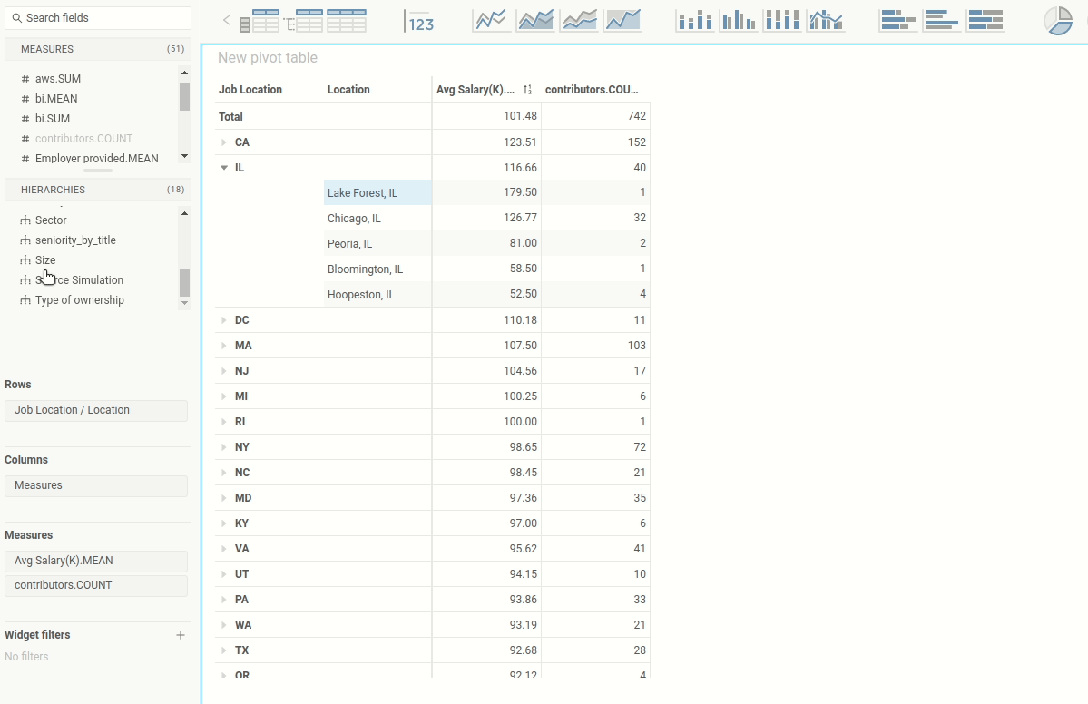
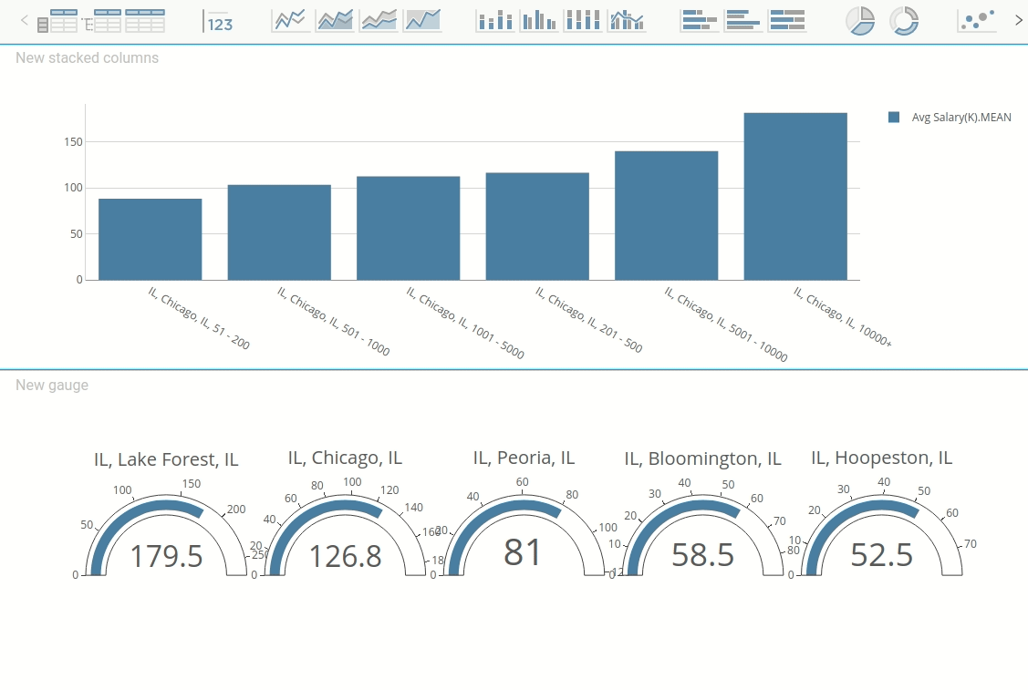
Salary by City within a Specific State
So far we only know salary by state. However, you might care more about salary by the city since salary can vary a lot between cities within a state.
Let’s figure out the salary by the city in Illinois by dragging the Location tab to the value IL .

Hah! Interesting. The mean salary in Lake Forest, IL is higher than the mean salary in Chicago, IL. Since Chicago is a bigger city with a higher cost of living, it seems a little bit odd to see that the mean salary in Chicago is smaller than the mean salary in Lake Forest, IL.
Could it be that there are not enough data points at Lake Forest to accurately represent the population? Let’s add contributors.COUNT to the table to find out how many data points there are per city.

Aha! There is only one data point at Lake Forest, IL while there are 32 data points at Chicago, IL. One data point at Lake Forest is not enough to generalize about the salary of the population at Lake Forest.
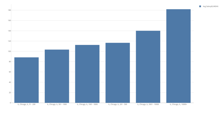
Find the Factors that Affect the Difference in Salary
Is there a way we can explain the difference in salary in the same location? It could be that bigger companies pay more to their employees. Let’s check our hypothesis by adding Size to the table.
The hypothesis seems to be correct. As the company size increases, the salary increases. Let’s visualize this relationship in Chicago, IL using a bar chart:
Cool!
Analyze Degrees Per Job Title Using a Stacked Bar Chart
So far, we have only aggregated a numerical column by one categorical column. Let’s aggregate a numerical column by two categorical columns and visualize this two-dimensional dataset using a stacked bar chart.
Stacked bar charts are useful for comparing parts of a whole.
Note that initially, a chart is not stacked. To stack the chart by Degree, drag Degree to the Stack by region.
In the stacked bar chart above,
- The blue bars represent a Master’s degree.
- The orange bars represent Ph.D. degrees.
- The red bars represent NaN. We can assume that these are people who don’t have either a Master’s degree or a Ph.D. degree.
It can be hard to compare the percentage of Ph.D. between different job titles since the count of each title is different. Let’s convert a normal stacked bar chart to a 100% stacked bar chart for comparison:


From the 100% stacked bar chart, it seems like a Ph.D. degree is common among machine learning engineers, data scientists, directors, and other scientists.
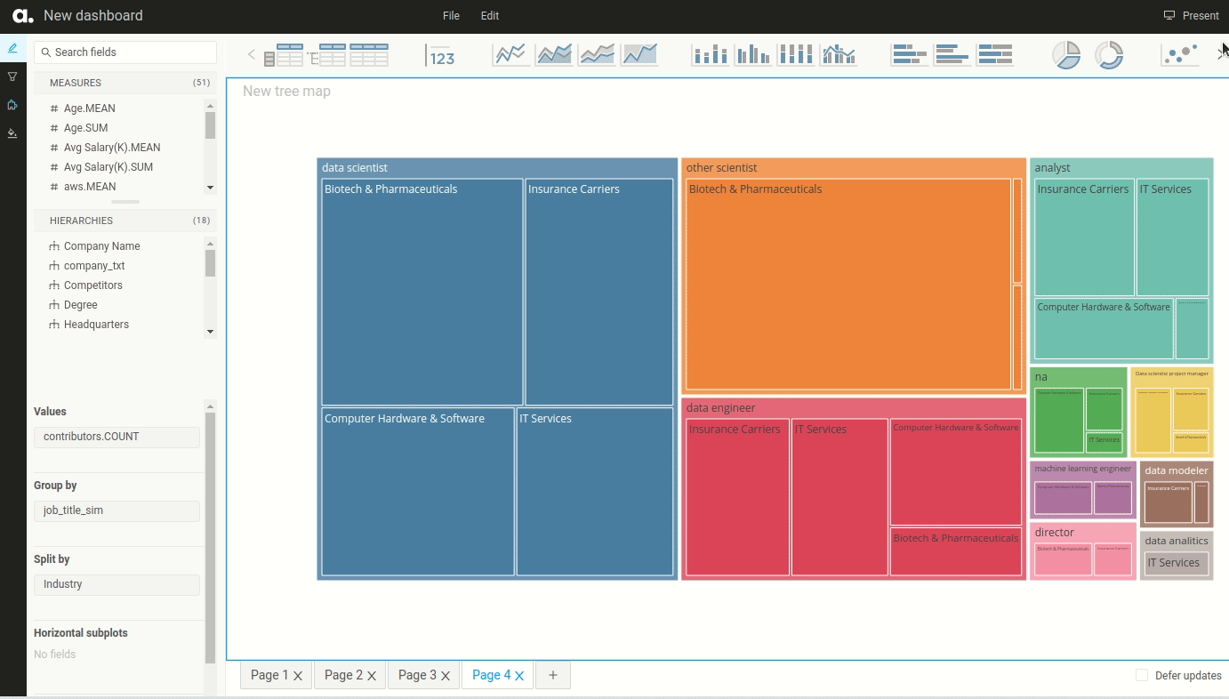
TreeMap and Filter
What industries do most data professionals work in? To answer this question, we create a 2-dimensional dataset whose dimensions are job_title_sim and industry and measure is countributor.Count .
Next, click the treemap icon to create a treemap. Treemaps are ideal for displaying data that is grouped and nested in a hierarchical structure.

Since there are many industries in one title, it is hard to read the treemap. Is there a way that we can show only the 4 most common industries per title? Yes, we can do that with Widget filters.
To choose the 4 most common industries, drag Industry to Widget filters and click Advanced.
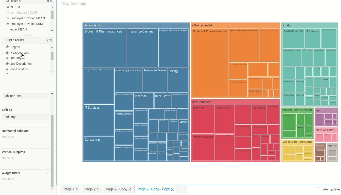
Nice! Now the treemap looks much easier to read. From the treemap below, we can see that the common industries among most data professionals are:
- Biotech & Pharmaceuticals
- Insurance Carriers
- Computer Hardware & Software
- IT Services
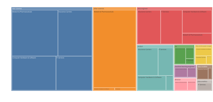
Multiple Charts in One Dashboard
To add multiple charts in one dashboard, you either add a new page:

Or drag another chart component to the same page:
Present and Share Your Dashboard
Okay, it is cool to be able to create a dashboard in your local machine. But what if you want to share your findings with others? Luckily, atoti also makes it easy to present and share your dashboard.
Present Your Dashboard
To present your dashboard, simply click the Present button in the top left of the screen. atoti will hide all Edit panels and only show the charts in your dashboard.
Share Your Dashboard
Your dashboard looks amazing, and you want your coworkers to have an opportunity to interact with your dashboard. How do you share your dashboard with them?

Right now, your dashboard is in your local machine:
http://localhost:9000/#/
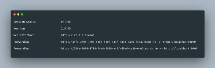
To turn your local web server into a public URL, use ngrok. Start with installing ngrok and set it up.
If your current port is 9000, type:
$ ngrok http 9000
… and a public URL will be automatically generated for you!
Now all you need is to send the public URL link to your coworkers so they can view it. Note that when you end the session in your local machine, your coworkers will no longer be able to view the dashboard.
Check out this tutorial on how to make your session more secure and this tutorial on how to deploy your dashboard.
