Exploratory Data Analysis

Exploratory Data Analysis(EDA) is the process of understanding and studying the data in detail to discover patterns, spot anomalies and outliers to maximize the insights we derive from the data set. We use data visualization techniques to recognize patterns and draw inferences that are not readily visible in the raw data.

EDA helps in selecting and refining the important features which would be used by machine learning models .

Purpose of EDA

  • Gain maximum insight into the dataset
  • To identify the various characteristics of data
  • Identify missing values and outliers
  • List the anomalies in the dataset
  • Identify the correlation between variables

Steps in EDA

In order to perform EDA, it’s good to structure your efforts using the below steps.

1.Data Sourcing

  • Import and read the data.

2. Data Inspection

  • Check for null values, invalid entries, presence of duplicate values
  • Summary statistics of the dataset

3. Data Cleaning and manipulation

  • Appropriate rows and columns
  • Take a call to either Impute or remove missing values using the context of the data set
  • Handle Outliers
  • Standardize Values
  • Data Type conversions

4. Analysis

  • Univariate Analysis
  • Bivariate Analysis
  • Multivariate Analysis

Libraries required to perform EDA

In this writeup, i will be using the below python libraries to perform EDA:

  1. Numpy — to perform numerical & statistical operations on a data set
  2. Pandas — makes it incredibly easy to work on large datasets by creating data frames
  3. Matplotlib & Seaborn to perform data visualization and develop inferences

Data Sourcing

Importing the dataset

Pandas is efficient at storing large data sets. Based on the filetype of your dataset, functions from pandas library can be used to import the dataset.

Some of the commonly used functions in pandas are: read_csv, read_excel, read_xml, read_json

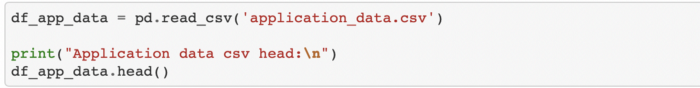
Below is an example to read a csv file using pandas library

Understanding the data

  1. Check for the shape of the dataset — This gives us a view of the total number of rows and columns.

2. You also need to ensure appropriate data types are loaded into the dataframe. To do so, you can list the various columns in the dataset and their data types using the .info method.

I have passed verbose = True to print the full summary

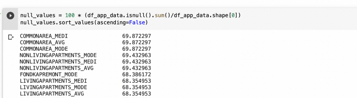
3. Identifying missing values

Large datasets usually have missing values and it’s important to handle these before we proceed with detailed analysis. You can check for the percentage of missing values by summing up all the NULL values ( by using .isnull().sum() ) and dividing it by total rows. I have used .shape and the 0 position in the tuple.

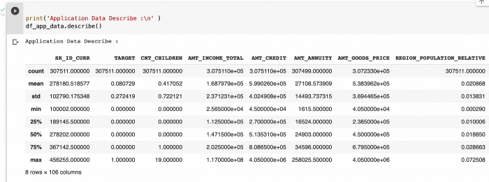
4. Summary Statistics

To get a good sense of the numerical data points, we can use the describe function.

This helps us get a feel for the data by studying values like standard deviation, min,max,mean, quantiles (25, 50,75)

Data Cleaning

1.Dropping Rows/Columns

Columns with large amount of missing values, say more than 40–50% null values, can be dropped

If the missing values for a feature are very low, we can drop rows that contain those missing values.

2. Imputing missing values

Process of estimating the missing values and filling them is called imputation. When the percentage of missing values is relatively low and you can impute the values.

There is no one right way to impute the missing value and you would have to decide based on the context of data, reasonable assumptions and assess the implications of imputing the missing values. Some of the ways you could go about imputing are the following ways:

  • For categorical variables, we could impute missing value with the dominant category i.e using the mode
  • For numerical variables, we could impute the missing values with mean/Median. Median is preferred when there are outliers in the data set as median would take the middle value of the dataset.
  • Sometimes it is also good to just impute the missing values with a label like “Missing” for analysis depending on the percentage of null values in the columns

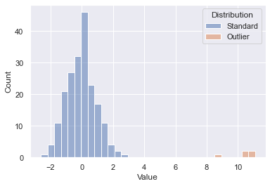
3. Handling Outliers

Outliers are values that are numerically distant from the rest of data points.

Some of the various approaches to handle outliers are:

  • Deletion of Outlier values
  • Imputing the values
  • Binning of values into categories
  • Capping the values
  • Performing a separate outlier analysis

Below is an example of how to slice the data into bins and create a new column in t the dataframe.

4. Standardizing values

  • All the values in a feature should be of a common and consistent unit.
  • We could standardize precision. For eg. numerical values could be rounded off to two decimal places.

5. Data Type conversions

All the features should be of correct data type. For eg. numerical values could be stored as strings in the dataset. We would not be able to get the min, max, mean, median etc for strings.

Now that we have cleaned the data, it’s ripe for analysis. This is where the fun begins and we can perform different types of analysis to spot patterns and identify feature we will later on use to build a model
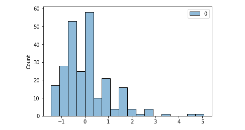
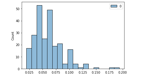
Univariate Analysis

In univariate analysis, we visualize a single variable and get summary statistics

Summary Statistics include:

  • Frequency distribution
  • Central Tendency — Mean, median, mode, max, min
  • Dispersion — variance, standard deviation and range

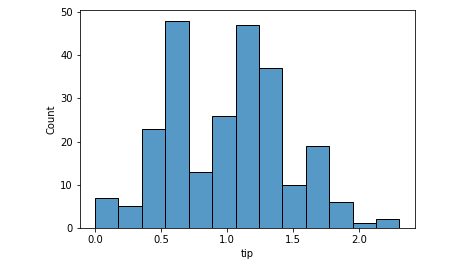
Univariate analysis should be done on both numerical and categorical variables.Plots like bar, pie, hist are useful for univariate analysis.
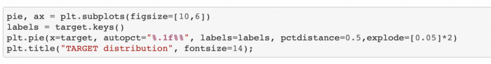
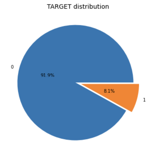
Pie Chart

Below is an example to create pie chart

Using functions to perform univariate analysis

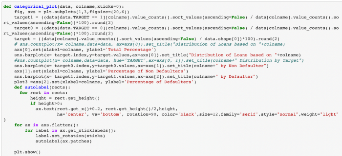
To avoid repeated lines of code and save time, I created functions which would perform univariate analysis of categorical and numerical variables.

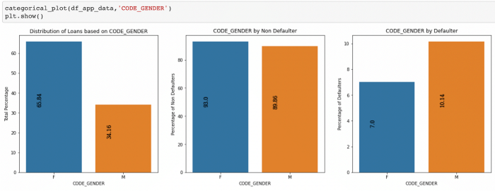
Below is an example of the function for categorical variables which plots the total percentage of values, percentage of defaulters and non defaulters split by TARGET variable for my case study:

Below is an example of the function for numerical variables

Bivariate and Multivariate Analysis

Bivariate analysis involves analyzing two variables to determine the relationship between them. Using Bivariate analysis, we can determine if there is a correlation between the variables.

Multivariate analysis involves analysis of more than two variables.The goal is to understand which variables influence the outcome and the relationship of variables with each other.

We could use various plots like scatter plot, box plot, heatmap for analysis.
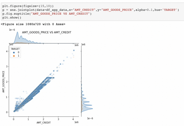
Joint plots

Below is an example of bivariate analysis which shows a positive correlation:

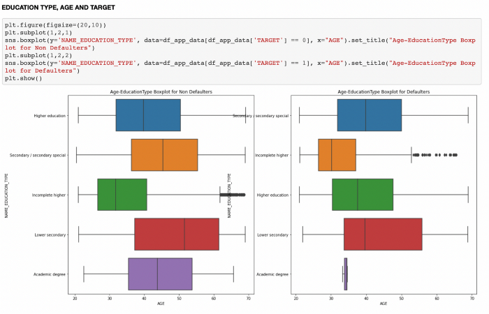
Box and whisker plot

Below is an example of bivariate analysis using boxplot:

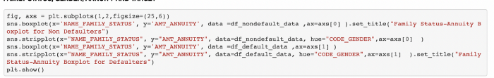
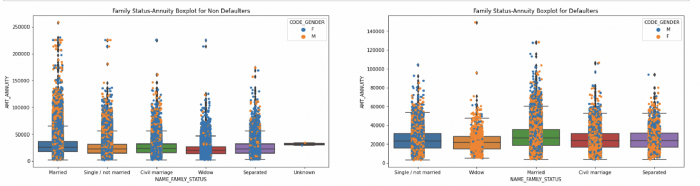
Boxplot used with Stripplot and Hue

Below is an example of multivariate analysis. Here, we segment the data based on various scenarios and draw insights using multivariate analysis.
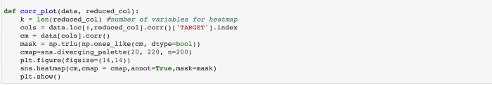
Heatmaps

Heatmaps are powerful and help visualize how multiple variables in our dataset are correlated.

Correlation coefficients indicates the strength between two variables and its values range from -1 to 1.

1 — indicates strong positive relationship

0 — indicates no relationship

-1 — indicates strong negative relationship

Below is an example of a function which plots a diagonal correlation matrix using heatmaps.

Conclusion:

In this writeup I have explained the various steps for performing Exploratory data analysis using Python code.

Automatic Hyperparameter Tuning with Sklearn Using Grid and Random Search

Grid and Random Search vs. Halving Search in Sklearn

What is a hyperparameter?

Today, algorithms that hide a world of math under the hood can be trained with only a few lines of code. Their success depends first on the data trained and then, on what hyperparameters were used by the user. So, what are these hyperparameters?

Hyperparameters are user-defined values like k in kNN and alpha in Ridge and Lasso regression. They strictly control the fit of the model and this means, for each dataset, there is a unique set of optimal hyperparameters to be found. The most basic way of finding this perfect set would be randomly trying out different values based on gut feeling. However, as you might guess, this method quickly becomes useless when there are many hyperparameters to tune.

Instead, today you will learn about two methods for automatic hyperparameter tuning: Random search and Grid search. Given a set of possible values for all hyperparameters of a model, a Grid search fits a model using every single combination of these hyperparameters. What is more, in each fit, the Grid search uses cross-validation to account for overfitting. After all combinations are tried, the search retains the parameters that resulted in the best score so that you can use them to build your final model.

Random search takes a bit different approach than Grid. Instead of exhaustively trying out every single combination of hyperparameters, which can be computationally expensive and time-consuming, it randomly samples hyperparameters and tries to get closer to the best set.

Fortunately, Scikit-learn provides GridSearchCV and RandomizedSearchCV classes that make this process a breeze. Today, you will learn all about them!

Prepping the Data

We will be tuning a RandomForestRegressor model on the Iowa housing dataset. I chose Random Forests because it has large enough hyperparameters that make this guide more informative but the process you will be learning can be applied to any model in the Sklearn API. So, let’s start:https://towardsdatascience.com/media/d7b0412b511700dd4b28fe62b009aefa

png

The target is SalePrice. For simplicity, I will choose only numeric features:https://towardsdatascience.com/media/4e6a70e08df418a5f413a3055bbbae8a

First, both training and test sets contain missing values. We will use SimpleImputer to deal with them:https://towardsdatascience.com/media/9a7621b5fd81fb3bc9cce8dd89c84038

Now, let’s fit a base RandomForestRegressor with default parameters. As we will use the test set only for final evaluation, I will create a separate validation set using the training data:https://towardsdatascience.com/media/2099176ac06771596c4746bae2f7f15f

Note: The main focus of this article is on how to perform hyperparameter tuning. We won’t worry about other topics like overfitting or feature engineering but only narrow down on how to use Random and Grid search so that you can apply automatic hyperparameter tuning in real-life setting.

We got a 0.83 for R2 on the test set. We fit the regressor only with default parameters which are:https://towardsdatascience.com/media/ae35d17450ef06e1f05209162c6bca1a

That’s a lot of hyperparameters. We won’t be tweaking all of them but focus only on the most important ones. Specifically:

  • n_esimators – number of trees to be used
  • max_feauters – the number of features to use at each node split
  • max_depth: the number of leaves on each tree
  • min_samples_split: the minimum number of samples required to split an internal node
  • min_samples_leaf: the minimum number of samples in each leaf
  • bootstrap: method of sampling – with or without replacement.

Both Grid Search and Random Search tries to find the optimal values for each of these hyperparameters. Let’s see this in action first with Random Search.

Randomized Search with Sklearn RandomizedSearchCV

Scikit-learn provides RandomizedSearchCV class to implement random search. It requires two arguments to set up: an estimator and the set of possible values for hyperparameters called a parameter grid or space. Let’s define this parameter grid for our random forest model:https://towardsdatascience.com/media/d805240c5d4c993caf314fcec1bb6349

This parameter grid dictionary should have hyperparameters as keys in the syntax they appear in the model’s documentation. The possible values can be given as an array.

Now, let’s finally import RandomizedSearchCV from sklearn.model_selection and instantiate it:https://towardsdatascience.com/media/57f52562c43cf746d17177cae8d82603

Apart from the accepted estimator and the parameter grid, it has n_iter parameter. It controls how many iterations of random picking of hyperparameter combinations we allow in the search. We set it to 100, so it will randomly sample 100 combinations and return the best score. We are also using 3-fold cross-validation with the coefficient of determination as scoring which is the default. You can pass any other scoring function from sklearn.metrics.SCORERS.keys(). Now, let’s start the process:

Note, since Randomized Search performs cross-validation, we can fit it on the training data as a whole. Because of how CV works, it will create separate sets for training and evaluation. Also, I am setting n_jobs to -1 to use all cores on my machine.

https://towardsdatascience.com/media/3146f2d946876db3e9f90c7af970920c

After ~17 minutes of training, the best params found can be accessed with .best_params_ attribute. We can also see the best score:

>>> random_cv.best_score_0.8690868090696587

We got around 87% coefficient of determination which is an improvement of 4% over the base model.

Sklearn GridSearchCV

You should never choose your hyperparameters according to the results of the RandomSearchCV. Instead, only use it to narrow down the value range for each hyperparameter so that you can provide a better parameter grid to GridSearchCV.

Why not use GridSearchCV right from the beginning, you ask? Well, looking at the initial parameter grid:https://towardsdatascience.com/media/57f1645b872d4f77c59f07d2fb7e4b93

There are 13680 possible hyperparam combinations and with a 3-fold CV, the GridSearchCV would have to fit Random Forests 41040 times. Using RandomizedGridSearchCV, we got reasonably good scores with just 100 * 3 = 300 fits.

Now, time to create a new grid building on the previous one and feed it to GridSearchCV:https://towardsdatascience.com/media/4a02f418e541552e49c7cc2666c5b244

This time we have:https://towardsdatascience.com/media/be08a4a3c16bec5b4bff12250b73e62c

240 combinations which is still a lot but we will go with it. Let’s import GridSearchCV and instantiate it:https://towardsdatascience.com/media/d867563df2bece43a947387821b9f5dc

I didn’t have to specify scoring and cv because we were using the default settings so don’t have to specify. Let’s fit and wait:https://towardsdatascience.com/media/17feee190b61ca91e3b078f306c2599c

After 35 minutes, we get the above scores, this time — truly the most optimal scores. Let’s see how much they differ from RandomizedSearchCV:

>>> grid_cv.best_score_0.8696576413066612

Are you surprised? Me too. The difference in results is marginal. However, this might be just a specific case to the given dataset.

When you have computation-heavy models in practice, it is best to get the results of random search and validate them in grid search within a tighter range.

Conclusion

At this point, you might be thinking that all this is great. You got to learn tuning models without even giving a second glance at what actually parameters do and still find their optimal values. But this automation comes at a great cost: it is both computation-heavy and time-consuming.

You might be okay to wait a few minutes for it to finish as we did here. But, our dataset had only 1500 samples. Still, finding the best parameter took us almost an hour if you combine both grid and random searches. Imagine how much you have to wait for large datasets out there.

So, Grid search and Random search for smaller datasets? Hands-down yes! For large datasets, you need to take a different approach. Fortunately, ‘the different approach’ is already covered by Scikit-learn… again. That’s why my next post is going to be on HalvingGridSearchCV and HalvingRandomizedSearchCV. Stay tuned!

Cogram.ai: A Coding Assistant for Data Science and Machine Learning

Codex powered autocompletions for data science and machine learning that run on jupyter notebooks

How Cogram works

First things first, to get set up with Cogram you have to head out to their website, there you sign up for a free account and get access to an API token. After that all you have to do is install Cogram with:

pip install -U jupyter -cogram

This enable a jupyter notebook extension:

jupyter nbextension enable jupyter-cogram/main

finally you set up a API token with:

python -m jupyter_cogram –token THE_API_TOKEN

with the set up done Cogram is enable by default you can turn it on and off

via the icon

image-2.png

you can  also customize Cogram, you can use the autosuggest mode, where Cogram makes suggestions whenever you stop typing,Also you can do Plain language to SQL.

or when you go to a new line. You can also use the manual completion option, triggered with the Tab key.The user can switch between these options via the Autosuggest tick-box in the Cogram menu.

Autocompletions on Jupyter Notebook

# plot sin(x) from 0 to pi

From writing this:

it generated this:

# plot sin(x) from 0 to pi

import numpy as np
import matplotlib.pyplot as plt

x = np.linspace(0, np.pi, 100)
y = np.sin(x)

plt.plot(x, y)
plt.show()

png

# plot a histogram of points from a poisson distribution

It generated this:

# plot a histogram of points from a poisson distribution

import numpy as np
import matplotlib.pyplot as plt

x = np.random.poisson(5, 1000)

plt.hist(x)
plt.show()

Another is a simple Linear regresssion:# create a fake dataset and run a simple linear regression model:The output:

# create a fake dataset and run a simple linear regression model

import numpy as np
import matplotlib.pyplot as plt

x = np.random.randn(100)
y = 2 * x + np.random.randn(100)

plt.scatter(x, y)
plt.show()

png

write a linear regression model with sklearn

import numpy as np
import matplotlib.pyplot as plt
from sklearn.linear_model import LinearRegression

x = np.random.randn(100)
y = 2 * x + np.random.randn(100)

model = LinearRegression()
model.fit(x.reshape(-1, 1), y.reshape(-1, 1))

plt.scatter(x, y)
plt.plot(x, model.predict(x.reshape(-1, 1)))
plt.show()

png

it creates what you really need including the code and the visualization or the plotting

Detecting Outliers Using Python

Using Isolation Forests for Automated Outlier Detection

What is Outlier Detection?

Detecting outliers can be important when exploring your data before building any type of machine learning model. Some causes of outliers include data collection issues, measurement errors, and data input errors. Detecting outliers is one step in analyzing data points for potential errors that may need to be removed prior to model training. This helps prevent a machine learning model from learning incorrect relationships and potentially lowering accuracy.

In this article, we will mock up a dataset from two distributions and see if we can detect the outliers.

Data Generation

To test out the outlier detection model, a fictitious dataset from two samples was generated. Drawing 200 points at random from one distribution and 5 points at random from a separate shifted distribution gives us the below starting point. You’ll see the 200 initial points in blue and our outliers in orange. We know which is which since this was generated data, but on an unknown dataset the goal is to essentially spot the outliers without having that inside knowledge. Let’s see how well some out of the box scikit-learn algorithms can do.

Initial Dataset

Isolation Forest

One method of detecting outliers is using an Isolation Forest model from scikit-learn. This allows us to build a model that is similar to a random forest, but designed to detect outliers.

The pandas dataframe starting point after data generation is as follows — one column for the numerical values and a second ground truth that we can use for accuracy scoring:

Initial Dataframe — First 5 Rows

Fit Model

The first step is to fit our model, note the fit method just takes in X as this is an unsupervised machine learning model.

Predict Outliers

Using the predict method, we can predict whether a value is an outlier or not (1 is not an outlier, closer to -1 is an outlier)

Review Results

To review the results, we’ll both plot and calculate accuracy. Plotting our new prediction column on the original dataset yields the following. We can see that the outliers were picked up properly; however, some of the tails of our standard distribution were as well. We could further modify a contamination parameter to tune this to our dataset, but this is a great out of the box pass.

Accuracy, precision, and recall can also be simply calculated in this example. The model was 90% accurate as some of the data points from the initial dataset were incorrectly flagged as outliers.

Output: Accuracy 90%, Precision 20%, Recall 100%

Explain Rules

We can use decision tree classifiers to explain some of what is going on here.

|--- Value <= 1.57
| |--- Value <= -1.50
| | |--- class: Outlier
| |--- Value > -1.50
| | |--- class: Standard
|--- Value > 1.57
| |--- class: Outlier

The basic rules are keying off -1.5 and 1.57 as the range to determine “normal” and everything else is an outlier.

Elliptic Envelope

Isolation forests are not the only method for detecting outliers. Another that is suited for Gaussian distributed data is an Elliptic Envelope.

The code is essentially the same, we are just swapping out the model being used. Since our data was pulled from a random sample, this resulted in a slightly better fit.

Output: Accuracy 92%, Precision 24%, Recall 100%

Different outlier detection models can be run on our data to automatically detect outliers. This can be a first step taken to analyze potential data issues that may negatively affect our modeling efforts.

Normalization, Standardization and Normal Distribution

Understand the difference, when to use and how to code it in Python

I will start this post with a statement: normalization and standardization will not change the distribution of your data. In other words, if your variable is not normally distributed, it won’t be turn into one with the normalize method.

normalize() or StandardScaler() from sklearn won’t change the shape of your data.

Standardization

Standardization can be done using sklearn.preprocessing.StandardScaler module. What it does to your variable is centering the data to a mean of 0 and standard deviation of 1.

Doing that is important to put your data in the same scale. Sometimes you’re working with many variables of different scales. For example, let’s say you’re working on a linear regression project that has variables like years of study and salary.

Do you agree with me that years of study will float somewhere between 1 to 30? And do you also agree that the salary variable will be within the tens of thousands range?

Well, that’s a big difference between variables. That said, once the linear regression algorithm will calculate the coefficients, naturally it will give a higher number to salary in opposition to years of study. But we know we don’t want the model to make that differentiation, so we can standardize the data to put them in the same scale.

import pandas as pd
import seaborn as sns
from sklearn.preprocessing import StandardScaler, normalize
import scipy.stats as scs# Pull a dataset
df = sns.load_dataset('tips')# Histogram of tip variable
sns.histoplot(data=df, x='tip');
Histogram of the ‘tip’ variable. Image by the author.

Ok. Applying standardization.

# standardizing
scaler = StandardScaler()
scaled = scaler.fit_transform(df[['tip']])# Mean and Std of standardized data
print(f'Mean: {scaled.mean().round()} | Std: {scaled.std().round()}')[OUT]: Mean: 0.0 | Std: 1.0# Histplot
sns.histplot(scaled);
Standardized ‘tip’. Image by the author.

The shape is the same. It wasn’t normal before. It’s not normal now. And we can take a Shapiro test for normal distributions before and after to confirm. The p-Value is the second number in the parenthesis (statistic test number, p-Value) and if smaller than 0.05, it means not normal distribution.

# Normal test original data
scs.shapiro(df.tip)[OUT]: (0.897811233997345, 8.20057563521992e-12)# Normal test scaled data
scs.shapiro(scaled)[OUT]: (0.8978115916252136, 8.201060490431455e-12)

Normalization

Normalization can be performed in Python with normalize() from sklearn and it won’t change the shape of your data as well. It brings the data to the same scale as well, but the main difference here is that it will present numbers between 0 and 1 (but it won’t center the data on mean 0 and std =1).

One of the most common ways to normalize is the Min Max normalization, that basically makes the maximum value equals 1 and the minimum equals 0. Everything in between will be a percentage of that, or a number between 0 and 1. However, in this example we’re using the normalize function from sklearn.

# normalize
normalized = normalize(df[['tip']], axis=0)# Normalized, but NOT Normal distribution. p-Value < 0.05
scs.shapiro(normalized)[OUT]: (0.897811233997345, 8.20057563521992e-12)
Tip variable normalized: same shape. Image by the author.

Again, our shape remains the same. The data is still not normally distributed.

Then why to perform those operations?

Standardization and Normalization are important to put all of the features in the same scale.

Algorithms like linear regression are called deterministic and what they do is to find the best numbers to solve a mathematical equation, better said, a linear equation if we’re talking about linear regression.

So the model will test many values to put as each variable’s coefficients. The numbers will be proportional to the magnitude of the variables. That said, we can understand that variables floating on the tens of thousands will have higher coefficients than those in the units range. The importance given to each will follow.

Including very large and very small numbers in a regression can lead to computational problems. When you normalize or standardize, you mitigate the problem.

Changing the Shape of the Data

There is a transformation that can change the shape of your data and make it to approximate of a normal distribution. That is the logarithmic transformation.

# Log transform and Normality 
scs.shapiro(df.tip.apply(np.log))[OUT]: (0.9888471961021423, 0.05621703341603279)
p-Value > 0.05 : Data is normal# Histogram after Log transformation
sns.histplot(df.tip.apply(np.log) );
Variable ‘tip’ log transformed. Now it is a normal distribution. Image by the author.

The log transformation will remove the skewness of a dataset because it puts everything in perspective. The variances will be proportional rather than absolute, thus the shape changes and resembles a normal distribution.

A nice description I saw about this is that log transformation is like looking at a map with a scale legend where 1 cm = 1 km. We put the whole mapped space on the perspective of centimeters. We normalized the data.

When to Use Each

As far as I researched, there is no consensus whether it’s better to use Normalization or Standardization. I guess each dataset will react differently to the transformations. It is a matter of testing and comparing, given the computational power these days.

Regarding the log transformation, well, if your data is not originally normally distributed, it won’t be a log transformation that will make it that way. You can transform it, but you must reverse it later to get the real number as prediction result, for example.

The Ordinary Least Squares (OLS) regression method — calculates the linear equation that best fits to the data considering that the sum of the squares of the errors is minimum — is a math expression that predicts y based on a constant (intercept value) plus a coefficient multiplying X plus an error component (y = a + bx + e). The OLS method operates better when those errors are normally distributed, and the analyzing the residuals (predicted – actual value) are the best proxy for that.

When the residuals don’t follow a normal distribution, it is recommended that we transform the independent variable (target) to a normal distribution using a log transformation (or another Box-Cox power transformation). If that is not enough, then you can try transforming the dependent variables as well, aiming for a better fit of the model.

Thus, log transformation is recommended if you’re working with a linear model and needs to improve the linear relationship between two variables. Sometimes the relationship between variables can be exponential and log is the inverse operation of the exponential power, thus a curve becomes a line after transformation.

An exponential relationship that became a line after a log transformation. Image by the author.

Before You Go

I am no statistician or mathematician. I always make that clear and I also encourage statisticians to help me to explain this content to a broader public, the easiest way possible.

It is not easy to explain such a dense content in simple words.

I will end here with these references.

Why to log transform.

Normalization and data shape.

Normalize or Not.

When to Normalize or Standardize.

If this content is useful, follow my blog for more.